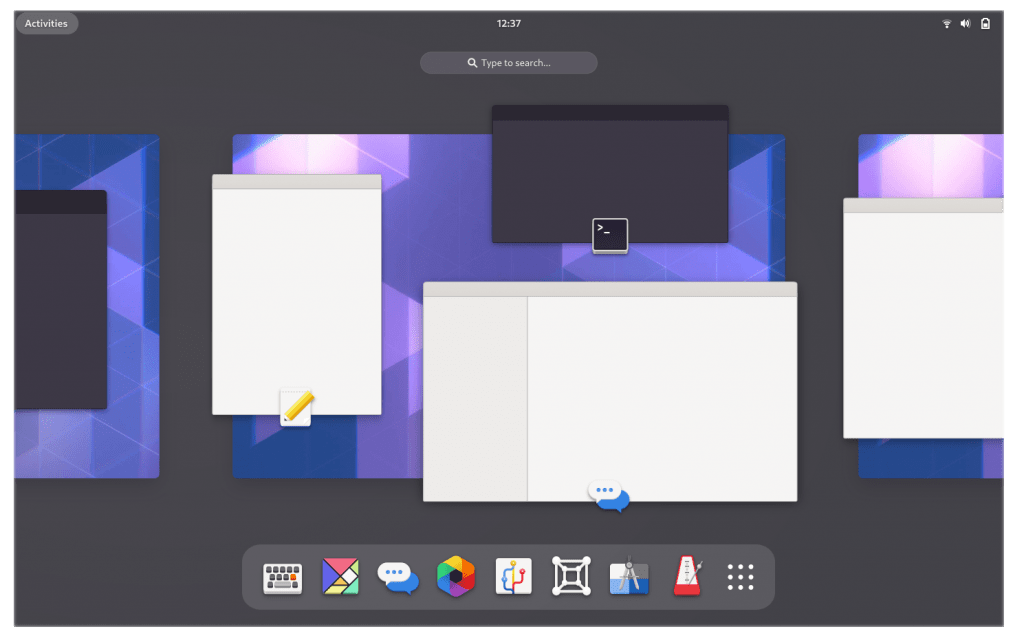
GNOME developers have announced that they are bringing some major Shell UX changes in the next major release of GNOME 40. GNOME team has been working on updated designs for Activities Overview. As a result, there are many futuristic changes proposed for the next versions of GNOME desktop.
Suggested UX changes in GNOME 40
Please keep in mind that these are proposed changes and the images shared here are mock-ups shared by GNOME development team.
Basically, the focus is on providing horizontal spatial instead of vertical.
Reimagined Activities overview

Workspaces are now arranged horizontally with added physical quality. They appear in a continuous sequence, from left to right. The sequence can be panned and scrolled.
In the overview, windows have app icon on them, with the window title being shown on hover.
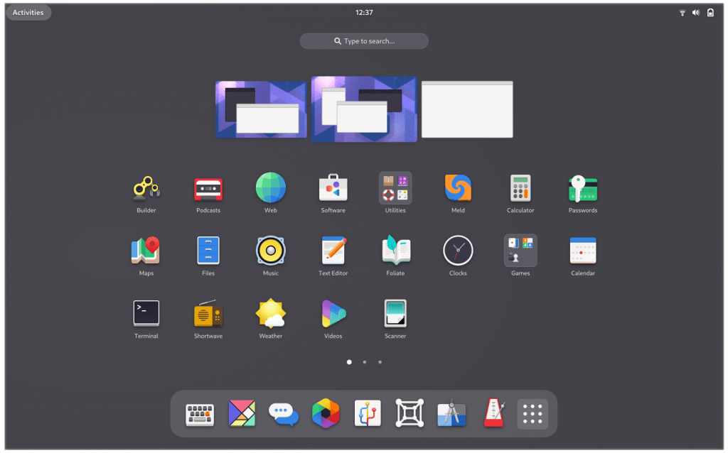
Customizable App Grid

The new design is fairly similar to what is already in the GNOME 3.38 release. The important feature here is more customization ability to the app grid. As a result, now launchers can be arranged at will, both within multiple pages as well as using folders.
The main difference between the new design and the current GNOME app grid is the orientation of the pages. That’s why app grid pages are now horizontal rather than vertical.
Intuitive navigation
The design aims to support intuitive navigation and orientation. It is the primary motivation for changing the orientation of workspaces from vertical to horizontal. As the workspaces are laid out horizontally, the vertical axis can be used to control movement in and out of the overview and app grid.
This spatial arrangement is particularly powerful when navigating with touchpad gestures.
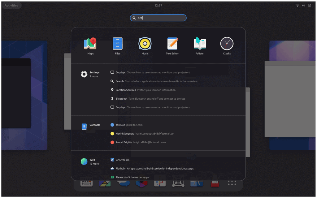
Search overlay

Previously, search replaced the overview with its own section. Now the search is just an overlay that preserves the aesthetics of new UX.
Autocomplete in Files
Files (Nautilus file manager) also gets a nice feature. GNOME is including an auto-complete feature of file and directory paths and possible options will be shown in a dropdown.
Will it consume more system resources? I cannot confirm or deny it at this stage.
Extensions Rebooted
The GNOME team is making an attempt to address the myriad of issues around the GNOME Shell Extension ecosystem. GNOME Shell Extensions are useful plugins, but they are plagued with dependency issues between GNOME versions.
So, they are tidying up the extension scenario. This will help extension developers to easily test their extensions with the new release codebase before the final release and create more stable and working extensions.
Excited for GNOME 40?
GNOME 40 is due to be released in March 2021. This will bring major UX improvements and the desktop will look more futuristic. I am really excited about these changes.
What do you think? Share your views in the comment section.
- Even the biggest players in the Linux world don't care about desktop Linux users. We do.
- We don't put informational content behind paywall. Your support keeps it open for everyone. Think of it like 'pay it forward'.
- Don't like ads? With the Plus membership, you get an ad-free reading experience.
- When millions of AI-generated content is being published daily, you read and learn from real human Linux users.
- It costs just $2 a month, less than the cost of your favorite burger.
Become a Plus Member today and join over 300 people in supporting our work.

![GNOME 40 is Looking to Bring Plenty of UX Changes [And That's a Good Thing]](/content/images/size/w30/wordpress/2020/12/ux-changes-gnome-40.png)


