
GNOME 46 release is around the corner, slated for release on March 20, 2024.
The beta version is available for development and user testing. And, we gave that a try 😊
Of course, unless you want to experiment, let me save your time and highlight the best bits of GNOME 46.
GNOME 46: What's New?
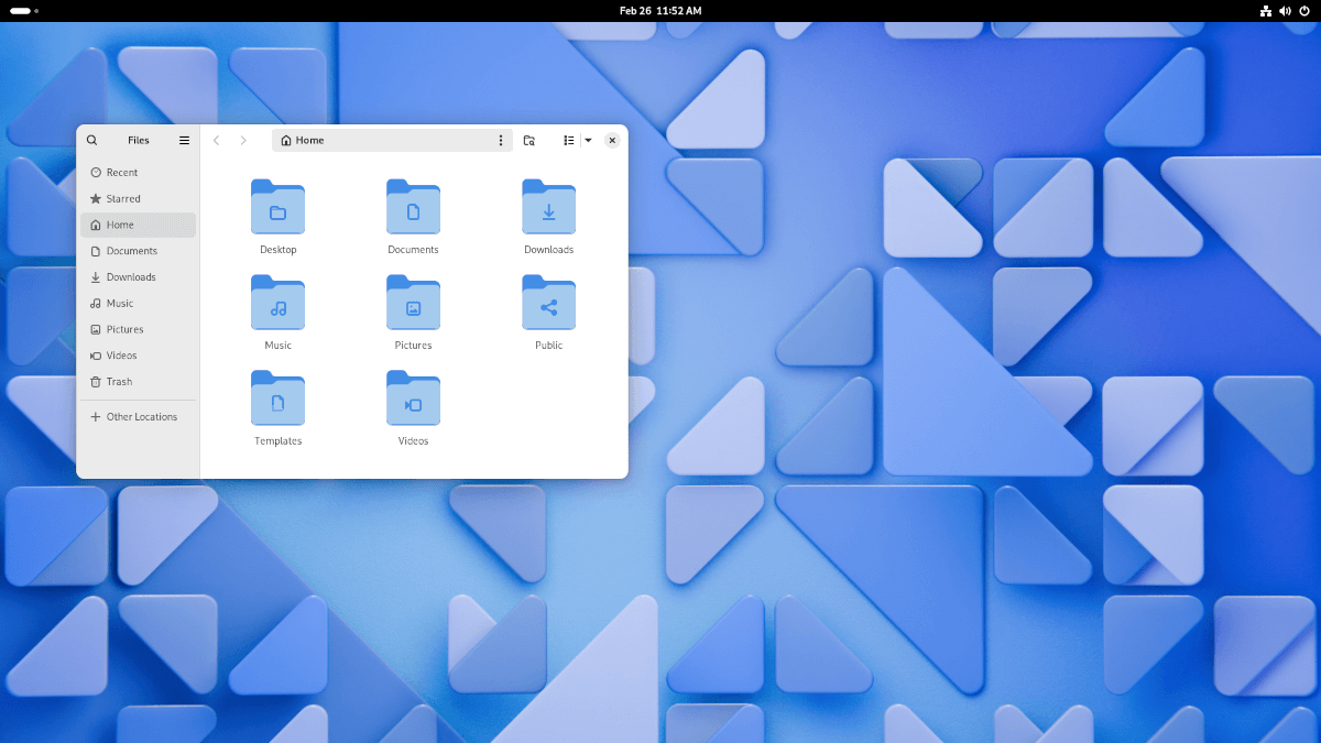
The overall look and feel of the desktop environment remains the same. However, there are some tweaks and upgrades across the board.
Nautilus File Manager Changes
Of course, with every version update, the file manager gets an improvement.
This time, with GNOME 46, Files refines its discoverability of custom folder icons, and comes packed with a new global search feature.
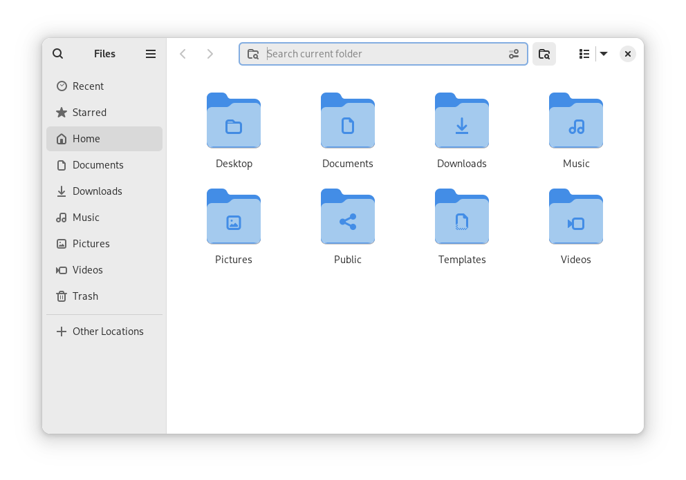
Files already had a search button, but now, you get a new search icon in the top-left corner of the window, and the older search icon gets a new look.
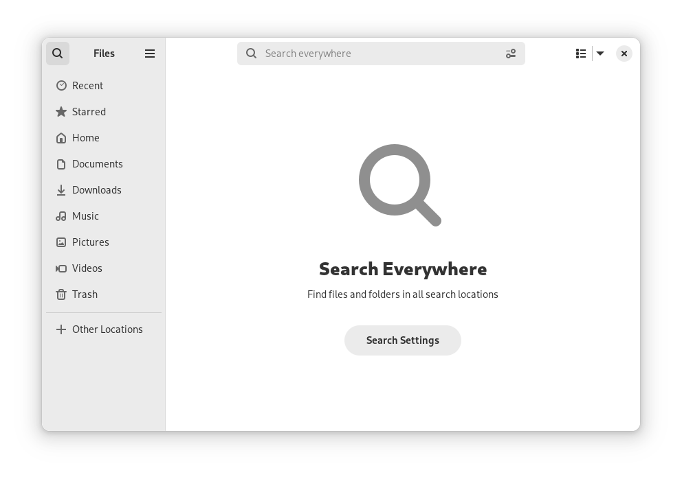
You can also head to search settings to adjust how you want to look for things.
The new search button lets you search across the system. However, the older one lets you search inside the current folder/directory you are in.
Additionally, there's a new "Date and Time Format" option under Preferences to give you control over how you see the dates/times when looking at the list of files.
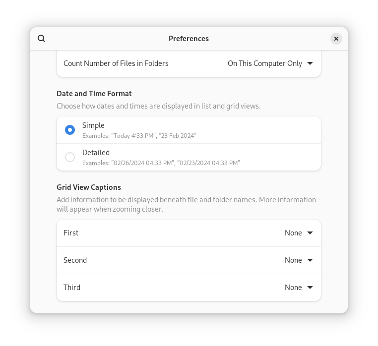
Of course, with fine-grained controls like this, the Nautilus file manager gets better with every upgrade.
Settings UI Refinements
GNOME devs have been fiddling around with the settings app for quite some time now, organizing and tidying things up.
With GNOME 46, there's a new "System" menu which includes Users, Date & Time, and Region & Language. So, you will find fewer menu items in the sidebar compared to GNOME 45:
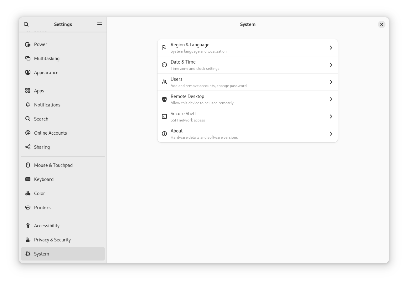
The "Privacy" setting is now "Privacy & Security":
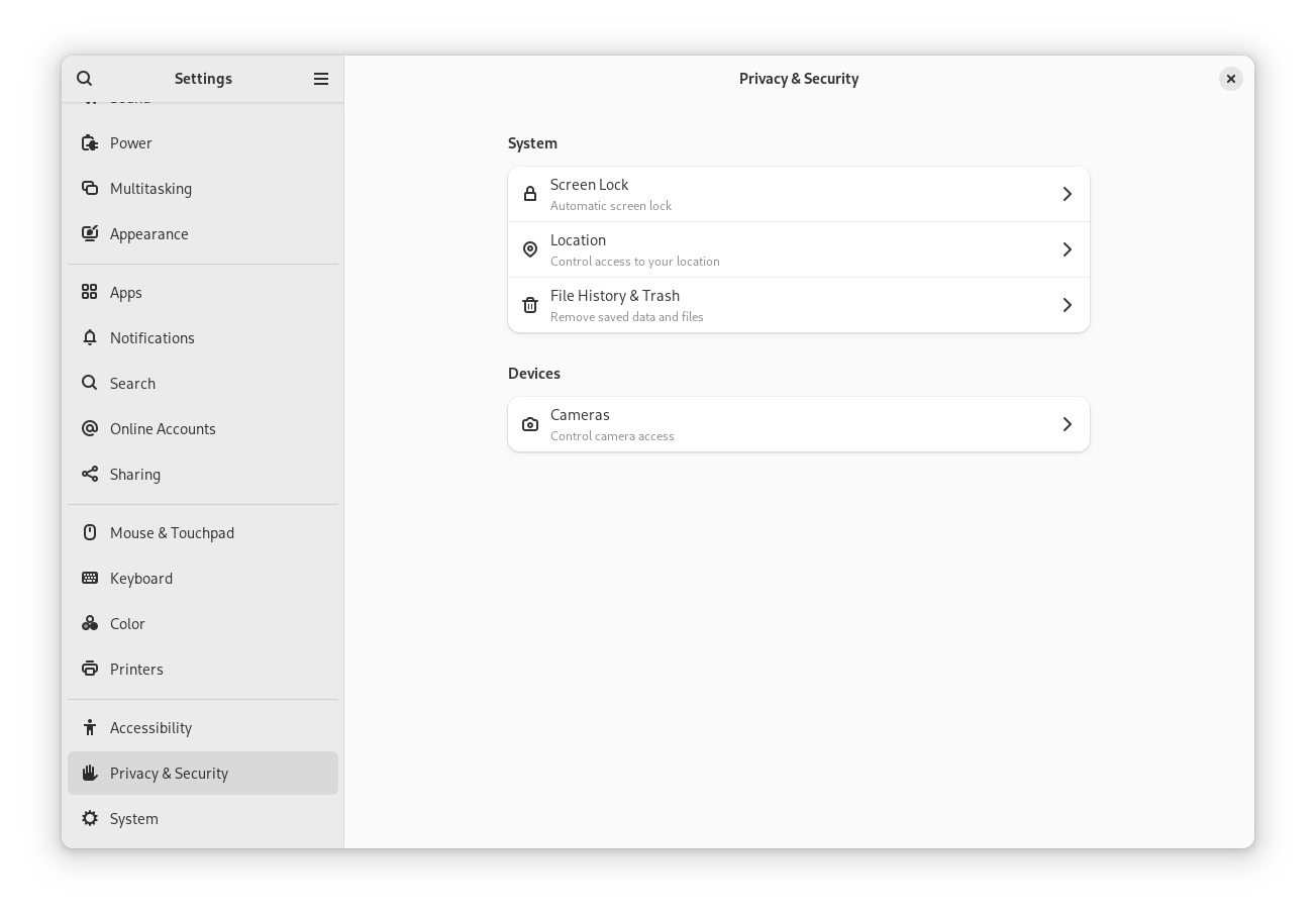
We have also seen the same changes with Ubuntu 24.04 LTS daily builds as of recently:
If you are curious, here's how the older menu looked like:
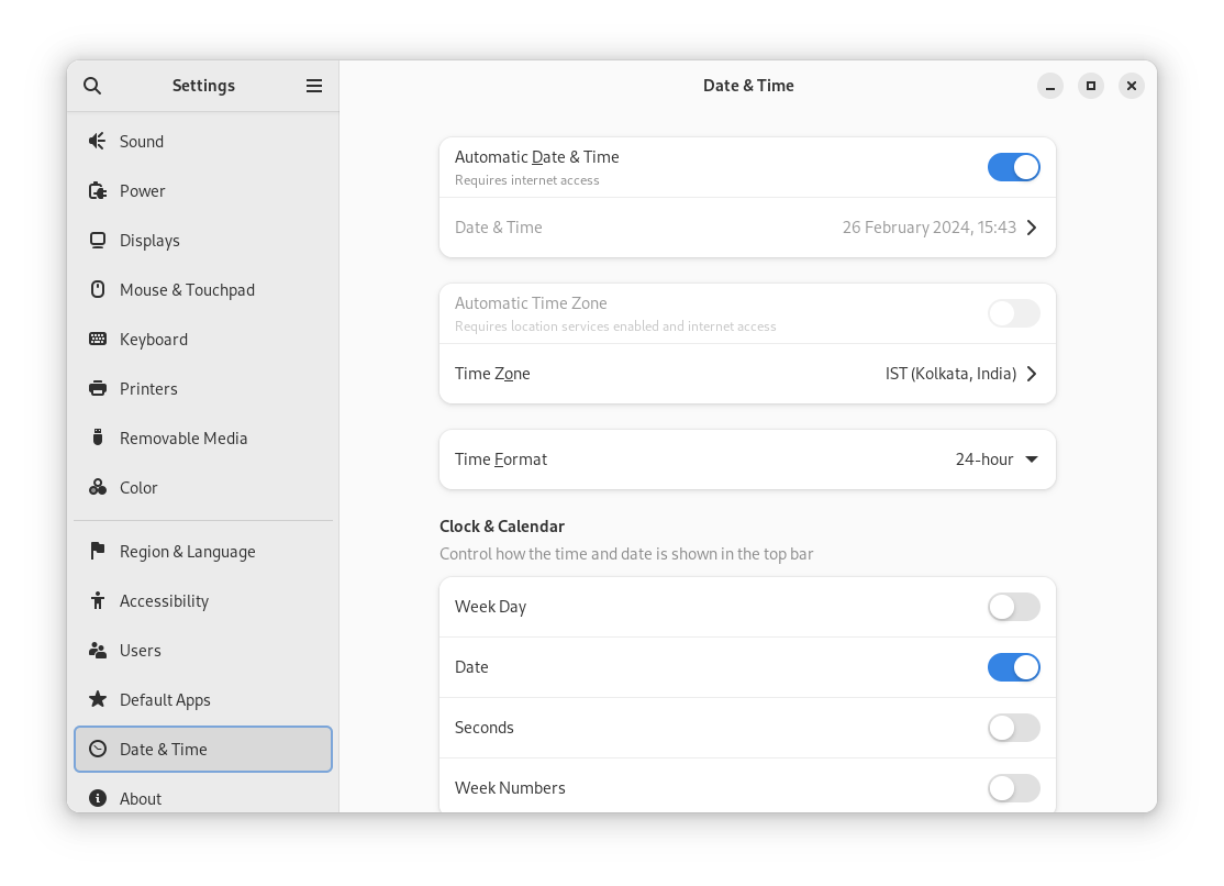
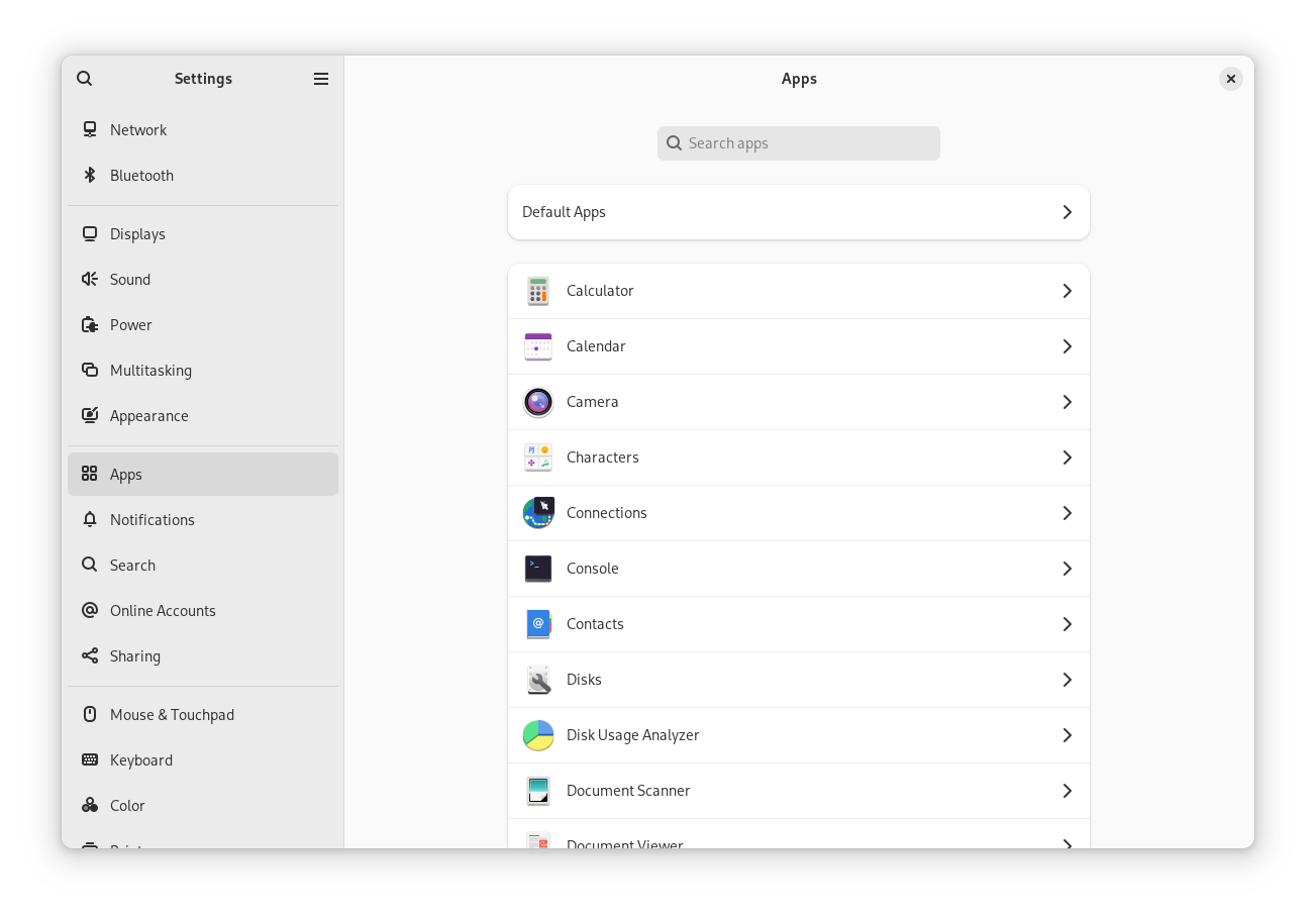
Some other menu options have also been re-arranged, like you can find the ability to change default apps and manage removable media from under "Apps":
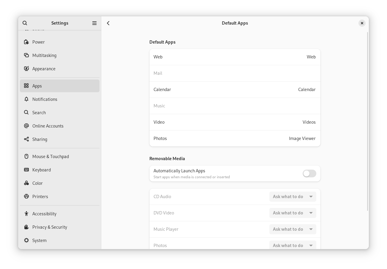
Before, you were greeted right with the individual app settings. Now, you get a list and a menu entry for "Default Apps" first:
Online Accounts Tweak
The online accounts functionality is no longer included in the initial setup of a distribution with GNOME.
So, you need to head to the online accounts menu, utilizing a web browser for authentication, providing a more secure way to add online synchronizations to your system.
Support for CardDav and CalDav providers has also been added.
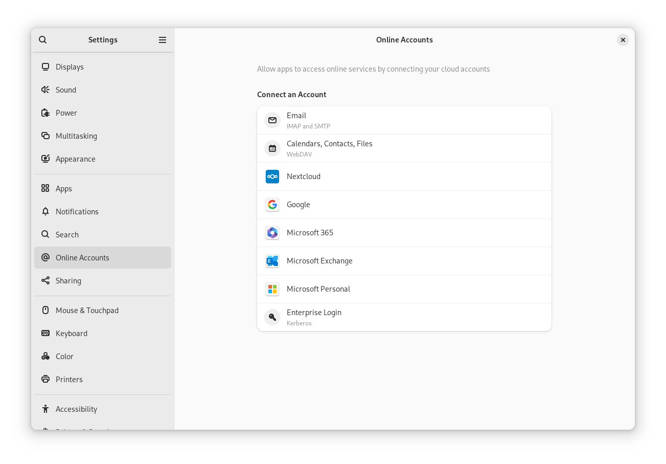
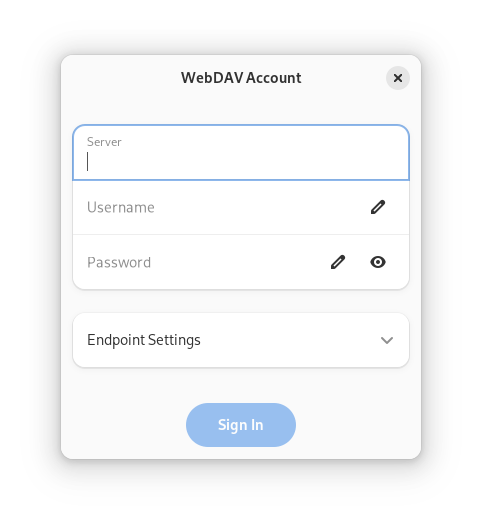
Not just limited to that, the UI for all these configurations has been modernized to make it look simpler:
GNOME Maps UI
I have been noticing smaller but meaningful updates to the user experience for GNOME maps.
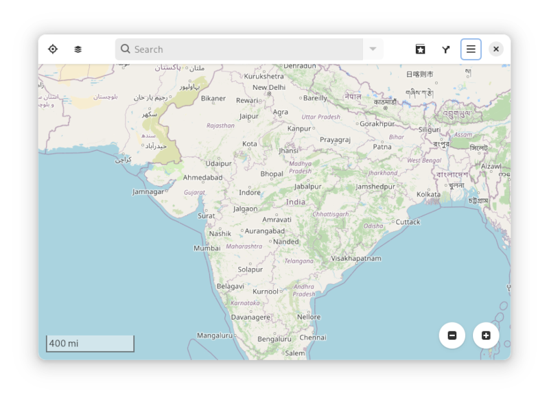
This time, the zoom buttons have got a makeover to look pretty. Not just the buttons, but the setup UI for OpenStreetMap was also tweaked to look modern and simple.
Notifications
The notifications are actually prettier this time, with added information about the app:

You get to see the app name of the notification "Screenshot", the icon for it, and the time of the notification "Just now".
I believe this makes the notification more meaningful when compared to the older style, which you can see here:

New Wallpapers
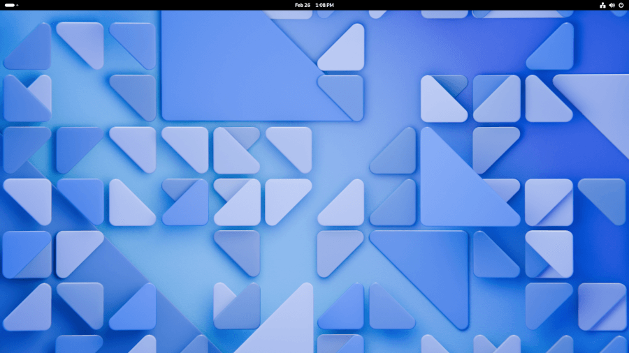
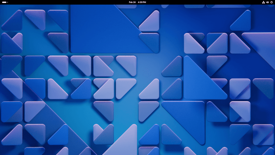
The new default wallpaper matches the modernization tweaks happening under-the-hood with GNOME 46, at least, in my opinion.
I like the light variant more than the dark variant here (which is just a dimmer/high-contrast version of it):
🛠️ Other Improvements
On top of the key highlights, there are several other technical changes which would result in a polished GNOME 46 experience:
- Performance improvements in Mutter
- Memory usage improvements
- A new renderer for GTK with native support for fractional scaling
- System Monitor ported to GTK 4
- Glycin 1.0 image decoding for secure experience in the image viewer
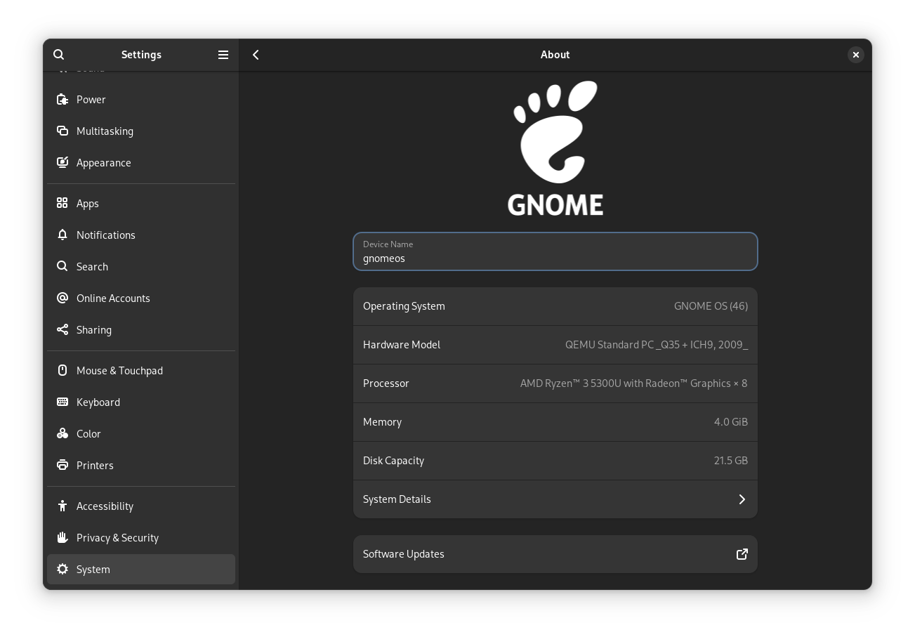
Currently, GNOME 46 is yet to be available with distributions. So, you can only test-drive with GNOME OS (using GNOME Boxes) or Fedora 40 (future nightly builds) until its final release next month.
💬 What do you think of the changes included with GNOME 46? Are they good enough? Share your thoughts in the comments section.
- Even the biggest players in the Linux world don't care about desktop Linux users. We do.
- We don't put informational content behind paywall. Your support keeps it open for everyone. Think of it like 'pay it forward'.
- Don't like ads? With the Plus membership, you get an ad-free reading experience.
- When millions of AI-generated content is being published daily, you read and learn from real human Linux users.
- It costs just $2 a month, less than the cost of your favorite burger.
Become a Plus Member today and join over 300 people in supporting our work.


