
We have a few months to go before the GNOME 43 release, but the development activity for GNOME applications is in full swing.
For instance, the support for extensions in GNOME Web 43 alpha version.
Similarly, there are a few exciting changes coming to GNOME Files (Nautilus), especially for the list view.
The list view was re-implemented using the GtkColumnView widget dropping GtkTreeView to be able to add new features.
Some of the changes that influence the code refinement include:
1. Drag and Select Files
Just like you would normally do in the grid view, you can finally select multiple items by simply dragging your mouse and selecting the ones you want in the list view.
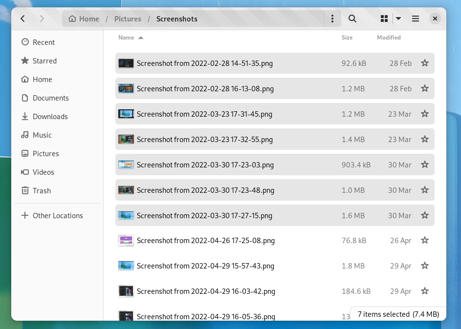
In case you did not notice, there is also a little bit of spacing between each row. The animation for selection is not the smoothest yet, but it is a work in progress.
Tried to record GIF with peek (Fedora with Wayland), but for some reason it was unresponsive, probably some conflicts with the alpha build.
2. Highlight Row on Mouse Hover
It was incredibly unintuitive to not have a row highlight when you hover your mouse over.
Now, it does. Just place your cursor on any of the items in the list view, and it should be highlighted, as shown in the image above.
3. Columns Do Not Go Away When You Search for a file
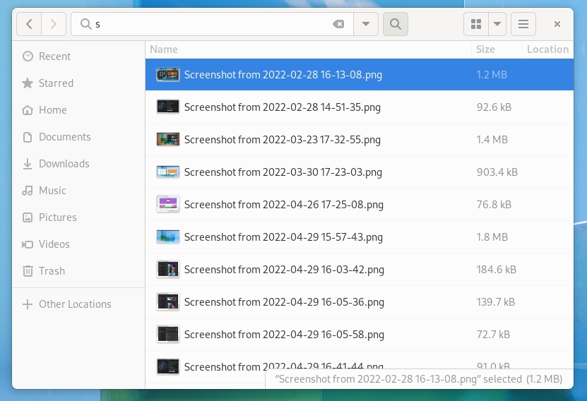
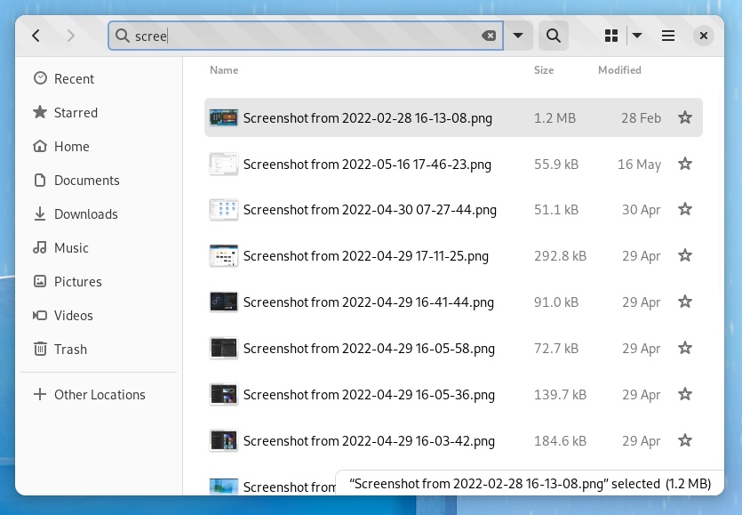
When you search for a file with the current Nautilus file manager, the columns are not handled in the best way possible. You get to lose certain details such as the file size.
With the new change, you still get to see the file size, the modified date, and the ability to star a file.
Definitely towards a better user experience with this change.
4. Better Compact View
When you scale down the size of the window with the file manager, it does not handle it well. You lose the file extension details, and the columns aren’t responsive to the change.
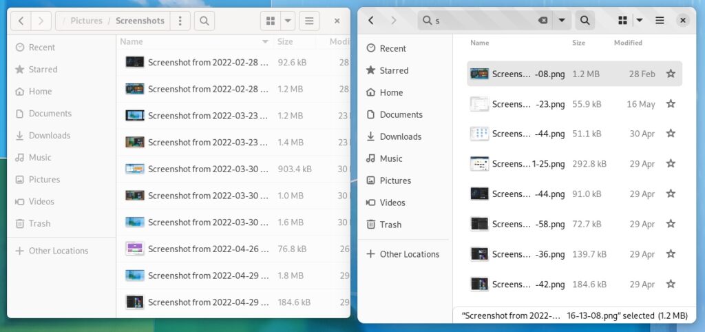
With the 43.alpha build for GNOME Files, even if you scale down the window size for a compact view, you still get to see the columns, and the extension for the files as shown above.
5. New Document Context Menu
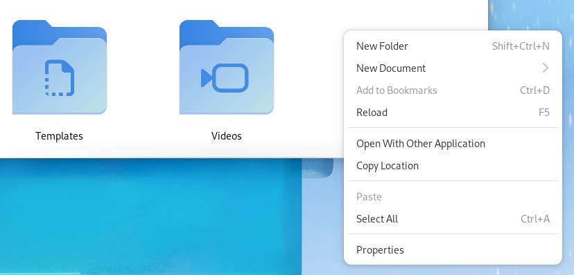
As part of a contribution to the GSoC (Google Summer of Code) 2022, a developer is focusing on improving the discoverability of the new document feature.
When you add certain files to the Templates directory, you can find the “New Document” option in the context menu when you perform a right-click.
With the upcoming update, this option will be available out of the box. So, it is more accessible.
Also, the developers are figuring out a way to improve the process of adding templates. You can explore more of their work in the blog post.
6. Animation when you star a file
When you click on the star icon on the right side of the list item, you can find it moving to let you know that you interacted with the option.
Wrapping Up
Of course, everything that I mention is in its development stage (alpha builds). As we wait for the beta builds, we should get clarity on more features coming to the file manager, and how things improve from there.
What are you looking forward to in GNOME 43? Let us know in the comments below.

- Even the biggest players in the Linux world don't care about desktop Linux users. We do.
- We don't put informational content behind paywall. Your support keeps it open for everyone. Think of it like 'pay it forward'.
- Don't like ads? With the Plus membership, you get an ad-free reading experience.
- When millions of AI-generated content is being published daily, you read and learn from real human Linux users.
- It costs just $2 a month, less than the cost of your favorite burger.
Become a Plus Member today and join over 300 people in supporting our work.


