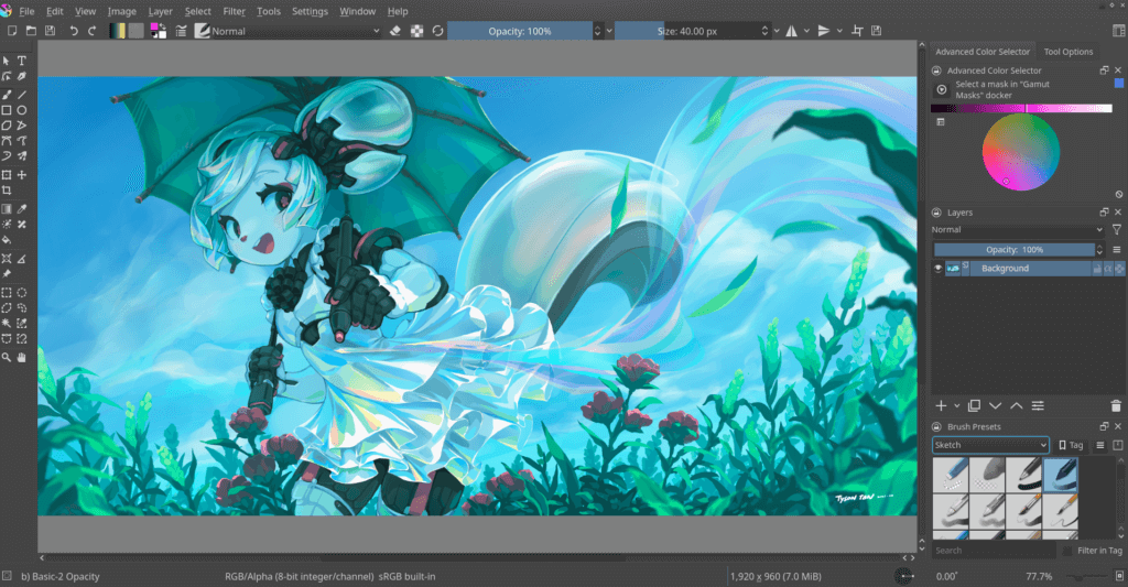
Alongside GIMP, Krita is among the most powerful graphics creation applications for Linux. While most well-known for its digital painting features, it is also a capable image editor and piece of animation software. Now, with its brand-new 5.0 release, many of these various aspects of Krita have been improved.
Let’s take a closer look!
What’s New In Krita 5.0?
As a major release, it is to be expected that the Krita development team has a huge number of new and improved features to offer. Fortunately, that appears to be the case, with far more improvements than I could ever hope to fit in this one article. However, here are some of the most impactful:
- Significantly improved gradients
- New options for exporting
- Various UI improvements
Here’s a video created by Krita team with music by Irene Fariña.
Not a fan of videos? No worries. Let me highlight the main features of Krita 5.0 release.
Improvements To Gradients
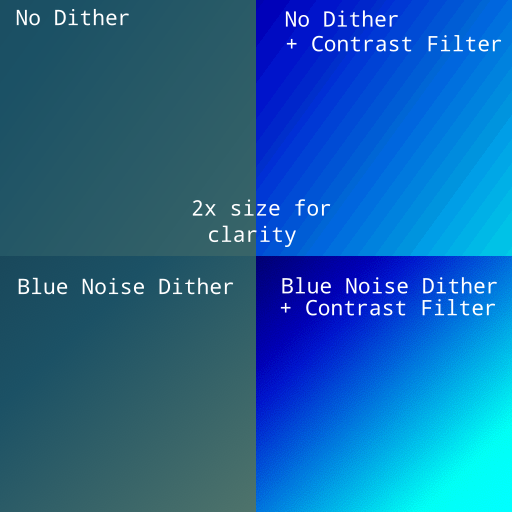
If you have ever looked closely at an image with a gradient, you may have noticed a number of blocks of color. These are generally referred to as “banding”, and are a result of using a relatively small color depth (generally 8-bit). However, this issue should now be an issue of the past thanks to the gradient improvements in Krita 5.0.

Using a technique called dithering, it is now possible to give the illusion of a smooth gradient in the same bit depth. In simple terms, it means combining the colors of surrounding pixels that the eye interprets as a color out of the range of the bit depth.
As well as these improvements to 8-bit color, gradients in 16 and 32-bit color images are now able to take full advantage of this increased color range. This should mean no more banding in these images as well.
New Exporting options
As new image standards emerge, it is always great to see updated applications supporting new formats. For Krita 5.0, this comes in the form of support for exporting and importing GIF, APNG, and WebP image types. The result is far less time trying to convert your image to the desired format, and more time spent painting.
Improved UI

It’s hard to think that the last time Krita received an icon refresh was all the way back in 2014. With more than 7 years gone by since then, the old icons have stood their ground admirably, but their expiry date is long overdue. Now, with Krita 5.0, this expiry date has come with a brand-new icon set featuring a flatter design and improved clarity.
Furthermore, the UI has also been blessed with the ability to detach the brush editor from the toolbar to create a separate window. This is great for a variety of use-cases, from people that make frequent changes to their brush, to those that using large multi-monitor setups.
Wrapping Up
Overall, Krita 5.0 has turned out to be a great release, just in time for Christmas too! Between the improved gradient handling, UI, and exporting options, this new Krita release is jam-packed full of useful new features.
If you want to try it right away, you can download the AppImage file on Linux.
And if you are a regular Krita user, please consider making a donation to support its development.
For a full list of all that’s new, it would be a great idea to have a look at their blog post. What are your thoughts on the upgrades and new features in Krita 5.0? Let us know in the comments below!
- Even the biggest players in the Linux world don't care about desktop Linux users. We do.
- We don't put informational content behind paywall. Your support keeps it open for everyone. Think of it like 'pay it forward'.
- Don't like ads? With the Plus membership, you get an ad-free reading experience.
- When millions of AI-generated content is being published daily, you read and learn from real human Linux users.
- It costs just $2 a month, less than the cost of your favorite burger.
Become a Plus Member today and join over 300 people in supporting our work.


