Linux Community Wins as Fedora Cancels 32-Bit Removal Plan
Fedora's 32-bit removal plan has been dropped due to intense backlash from the community.
Fedora's 32-bit removal plan has been dropped due to intense backlash from the community.

Orange Meets, now with E2EE.
That’s quite a surprising development, I must say.

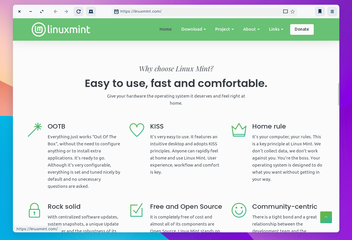
Linux Mint is one of the best Linux distributions available while offering a modern user experience.
However, Linux Mint’s original website looked dated and potentially unattractive to new-age computer users.
Many suggested a visual makeover to reflect Linux Mint’s taste through a modern website design. And, only recently the developers started working on a redesign in collaboration with the community members, asking for feedback and getting insights on proposed designs.
Finally, a design was finalized and applied to Linux Mint’s official website.
The website looks clean and informative, great on desktop, and perfectly fits mobile phone browsers!
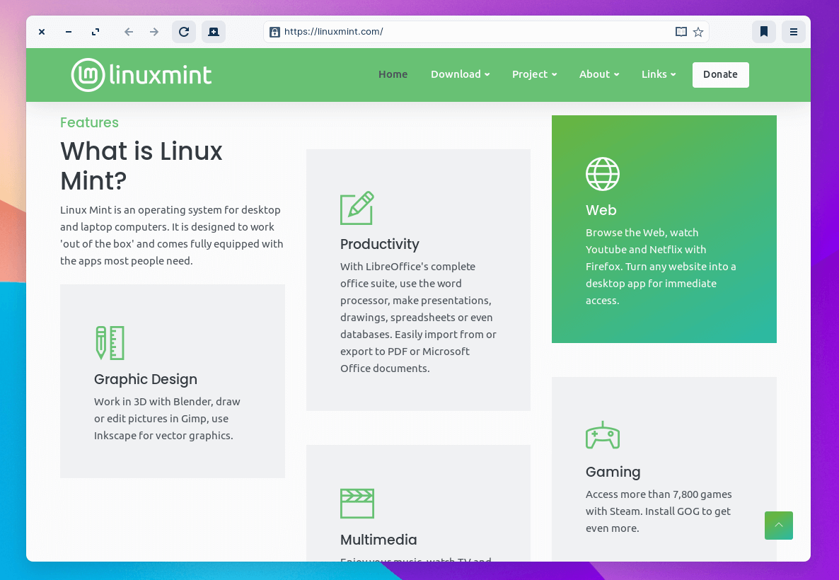
Every new Linux user should be able to evaluate their requirements by looking at the features offered easily.
The information is well-presented to convince users why they should try out Linux Mint on their desktop system.
The key highlights of the website would be the homepage, download page, and donation page.
Of course, you can choose to explore more about Linux Mint and how everything works through individual resources (like our articles), but the official website should be the essential starting point, which it is now.
The accent color and the theme combination feels just like what Linux Mint needed! Navigating through various web pages and the menu is a breeze. I don’t think there is any unnecessary element on the website; everything fits perfectly in the first look. The page load time is faster as well.
The blog/monthly news section continues to use the same design. And, I’m not certain if they intend to refresh that by applying the same design anytime soon. But, I think that should happen to ensure consistency between their web pages.
What do you think about Linux Mint’s new website design? Do you like it? Do you think this would help them get more attention from new-age users?
You are welcome to share your thoughts in the comments down below.
It's FOSS turns 13! 13 years of helping people use Linux ❤️
And we need your help to go on for 13 more years. Support us with a Plus membership and enjoy an ad-free reading experience and get a Linux eBook for free.
To celebrate 13 years of It's FOSS, we have a lifetime membership option with reduced pricing of just $76. This is valid until 25th June only.
If you ever wanted to appreciate our work with Plus membership but didn't like the recurring subscription, this is your chance 😃


Is this the end of fragmentation for Linux?


Another day, another Linux-related drama. This time, it's OBS Studio and Fedora going at it.

Linux websites are getting ill-treatment by Facebook.
Stay updated with relevant Linux news, discover new open source apps, follow distro releases and read opinions