Mozilla has had a rough year so far, with the PPA fiasco hurting its reputation in the open source community. To make matters worse, a recent wave of layoffs made people question if Mozilla had forgotten about their core principles.
Now, they have officially announced a rebranding that many, including us, have known about for a long time now. So, let's dive in. 👇
Mozilla's New Branding: What To Expect?
Source: Mozilla
Meant to symbolize their activist spirit, the new brand identity of Mozilla involves a custom semi-slab typeface that spells Mozilla, followed by a flag that was taken from the M of their name.
Mozilla points out that this is not just a rebranding, but something that will lay the foundation for the next 25 years, helping them promote the ideals of privacy and open source.
On the occasion, Mark Surman, President of Mozilla Corporation, added that:
As our personal relationships with the internet have evolved, so has Mozilla’s, developing a unique ability to meet this moment and help people regain control over their digital lives.
Since open-sourcing our browser code over 25 years ago, Mozilla’s mission has been the same – build and support technology in the public interest, and spark more innovation, more competition and more choice online along the way.
He further stated that they were missing opportunities to connect with new and existing users, and even though they were at the forefront of privacy and open source, they failed to get the full picture of what they were doing.
For this rebranding job, they signed up with Jones Knowles Ritchie (JKR) to help them revamp the brand and to better show what they wanted to achieve. JKR is well-known for their work on brands like Uber, Burger King, Chime, and many others.


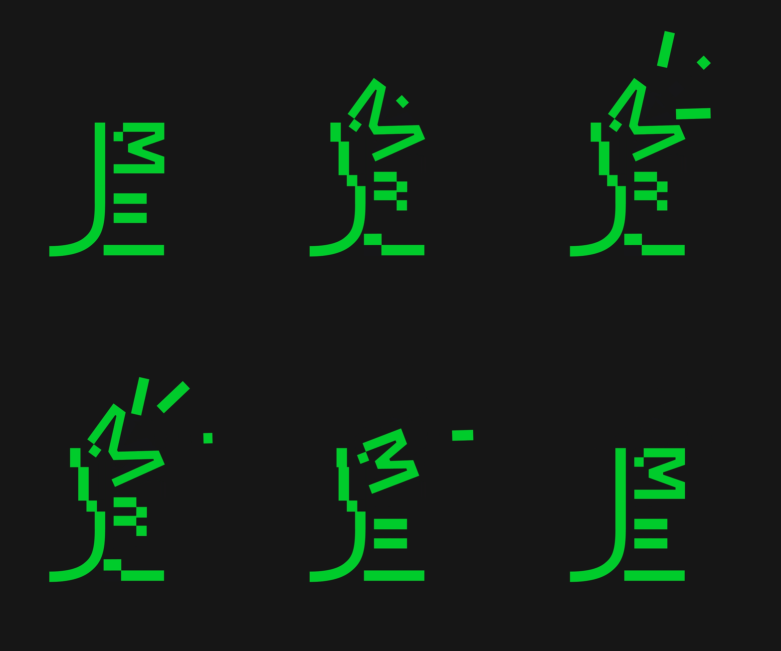
Mozilla's 2024 mascot roars!
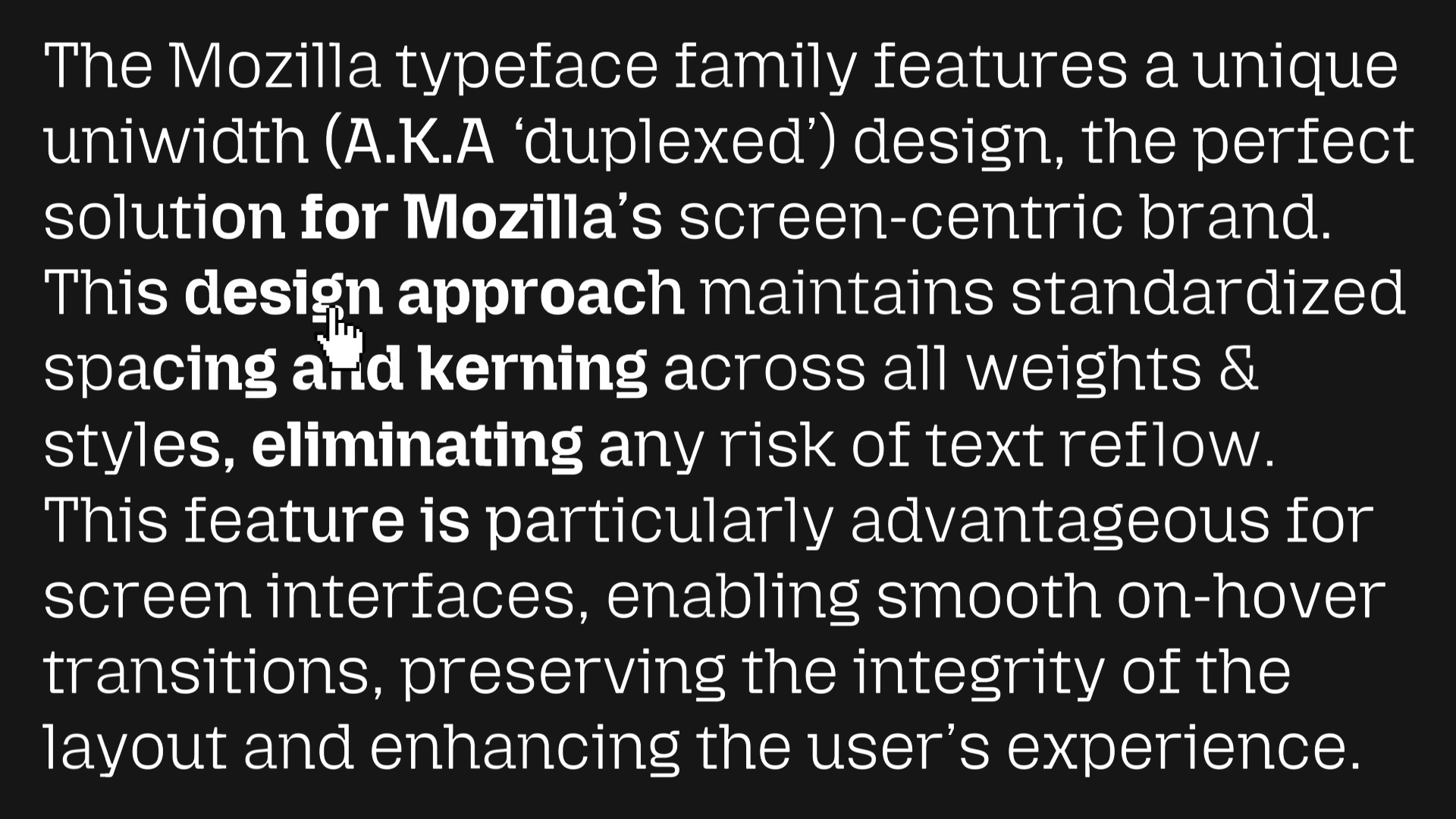
The typeface used for the revamp is pitched as a successor to the Mozilla slab serif. It features standardized spacing and kerning across styles, giving off a very streamlined look. There is also a new mascot that can roar, acting as a rallying cry for Mozilla's cause.
Commenting on this rebranding, Lisa Smith, Global Executive Creative Director at JKR, added that:
Mozilla isn’t your typical tech brand; it’s a trailblazing, activist organization in both its mission and its approach. The new brand presence captures this uniqueness, reflecting Mozilla’s refreshed strategy to ‘reclaim the internet.
The modern, digital-first identity system is all about building real brand equity that drives innovation, acquisition and stands out in a crowded market.
Trip Down Memory Lane

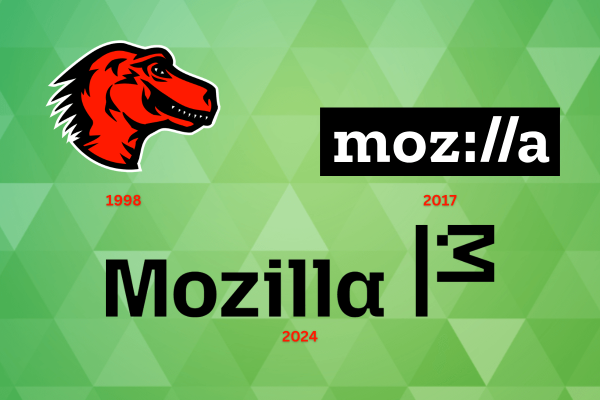
The first logo was the Mozilla Dino (1998) by Shepard Fairey, which featured a red dinosaur head, symbolizing Mozilla as a force to be reckoned with in the internet landscape back then. Next up was the modern Moz://a logo (2017), which replaced the “ill” bit with “://”.
I will be honest, I liked the Dino better.
Now, the 2024 logo is a nice mix of a custom typeface and a flag, which looks really neat in my opinion. But we have to wait and see where Mozilla as an organization heads next, as the recent happenings have eroded trust in the company for many in the open source community.
Hopefully, this rebrand turns things around, as we need organizations like this to survive. Otherwise, we will be left with the greedy Big Tech ones, who aren't really concerned with people or their rights.
Suggested Read 📖

- Even the biggest players in the Linux world don't care about desktop Linux users. We do.
- We don't put informational content behind paywall. Your support keeps it open for everyone. Think of it like 'pay it forward'.
- Don't like ads? With the Plus membership, you get an ad-free reading experience.
- When millions of AI-generated content is being published daily, you read and learn from real human Linux users.
- It costs just $2 a month, less than the cost of your favorite burger.
Become a Plus Member today and join over 300 people in supporting our work.


