Even though Adobe's acquisition of Figma failed, many users did feel the need to switch to free and open-source Figma alternatives, fearing how the prospective owners might handle their beloved web-based designing platform.
One such alternative that took a chunk out of Figma has been the open-source design tool Penpot, which now claims to serve over 600,000 professionals and 120,000 teams across the globe who use the platform to design all kinds of things.
And, we covered it back then when it released.
Now, Penpot has a milestone 2.0 release with much-awaited improvements. Let's see what it has to offer.
🆕 Penpot 2.0: What's New?
Announced as a major release, Penpot 2.0 brings about support for CSS Grid Layouts, which allows designers to easily create intuitive layouts while also allowing granular control over those with the added advantage of outputting developer-friendly code.
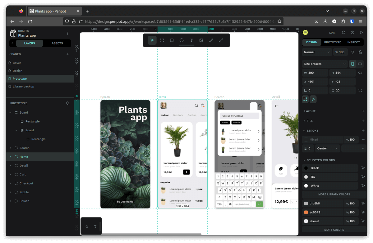
The user interface also sees an overhaul that was put together with accessibility in mind. For instance, the toolbar was moved to the top part of the interface, there are now dedicated panels for options such as the components, the new grid layout feature, and more.

Moreover, there is better iconography and typography, collapsible menus, improved reading contrast, and the ability to navigate just by using the keyboard.
You can explore more about the redesigned UI through a separate official video walk through:
The component libraries also see an upgrade, with a new data structure being implemented to better cater to designers. It also scales better now for larger deployments, thanks to being more modular in nature.
Penpot 2.0 also features HTML markup for existing SVG and CSS styles and an “image as fill” option to preserve image ratios. During the launch of this release, Pablo Ruiz-Múzquiz, CEO of Penpot added that:
Penpot 2.0 is an open-source product that fosters collaboration by breaking down barriers between designers and devs.
Born from user needs, our design-as-code approach creates a shared language and set of standards that unifies the development process and accelerates the creation of high-quality products.

🛠️ Other Changes and Improvements
Finally, there are the other notable changes, such as:
- Various performance optimizations.
- A new menu option to toggle between the light/dark themes.
- Keyboard shortcut for sending comments with “Ctrl+Enter” or “Cmd+Enter”.
- Fix for a crash when picking a recently used gradient color for a new color in the assets tab.
You can learn more about this release by checking out the official release notes and announcement.
📥 Try Penpot
You will have to sign up or log in to Penpot to take the new release for a run, and, you can also check out its source code on GitHub, if it's something that interests you.
You can check out the Penpot community to get help. Not to forget, they are organizing Penpot Fest 24 from June 5-7 in Barcelona, Spain. This brings both designers and developers together for three days of interactive events and featured speakers from the industry.
Suggested Read 📖

- Even the biggest players in the Linux world don't care about desktop Linux users. We do.
- We don't put informational content behind paywall. Your support keeps it open for everyone. Think of it like 'pay it forward'.
- Don't like ads? With the Plus membership, you get an ad-free reading experience.
- When millions of AI-generated content is being published daily, you read and learn from real human Linux users.
- It costs just $2 a month, less than the cost of your favorite burger.
Become a Plus Member today and join over 300 people in supporting our work.


