
Mastodon has been one of the most popular alternatives to X in the past few years, with many making the jump to socialize with a more friendly crowd, according to their personal preferences.
Sure, it has not become mainstream, but people now have many choices to explore the Fediverse, where's the harm in that?
Anyhow, those interested in further improving their Fediverse/Mastodon experience can take advantage of this really cool open-source desktop client for Linux.
Continue reading to find out more! 😃
Tuba: Overview ⭐
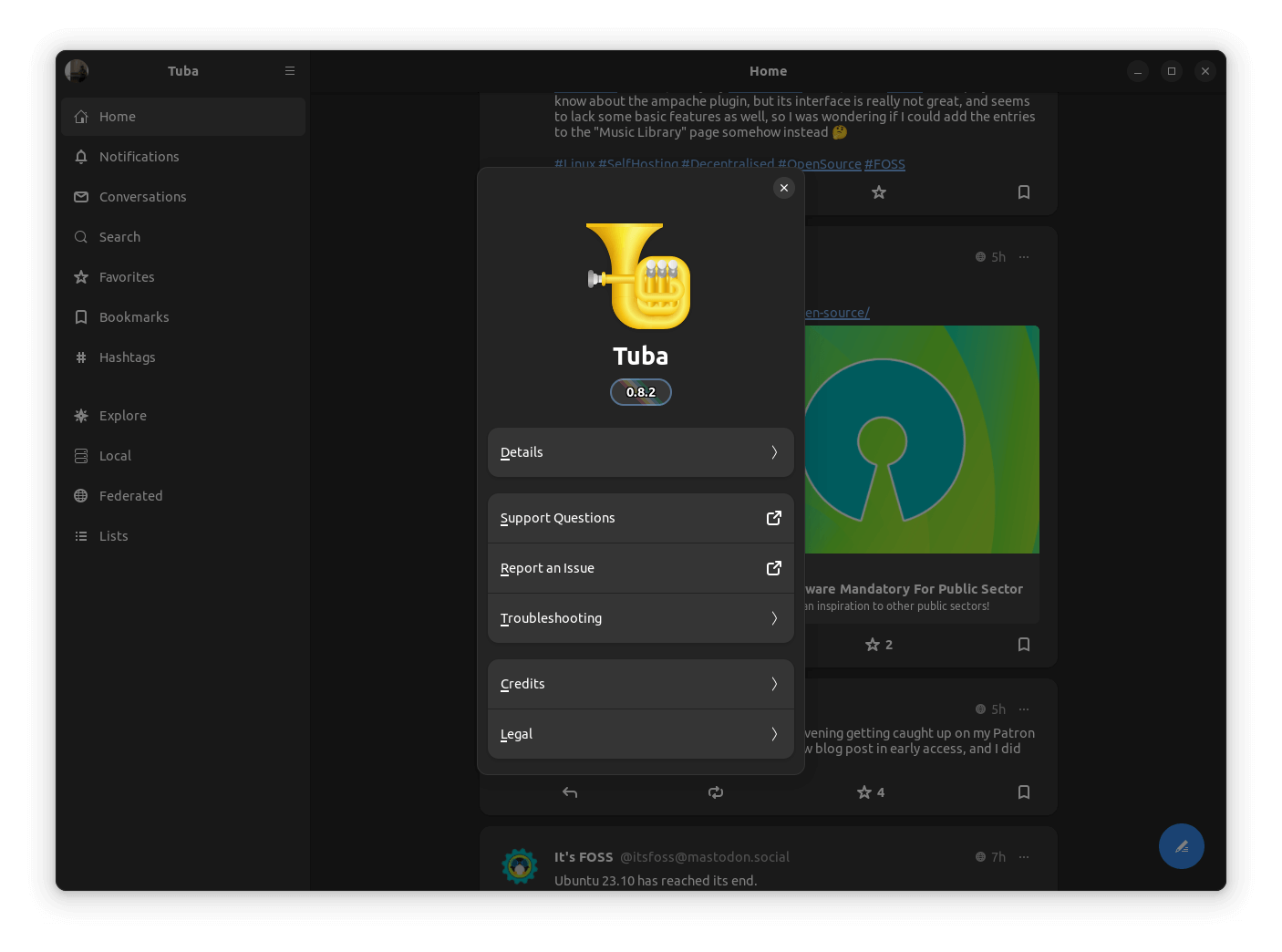
Developed by a group of dedicated developers, Tuba is a fork of the now defunct Mastodon client, Tootle, that is powered by the Vala programming language.
It has been made available under the GPL-3.0 License, and is actively maintained, with patches flowing in every other week.
Some key features of it include:
- Quick Setup
- Mobile-Friendly
- Intuitive User Interface
Initial Impressions 👨💻
Installation went by smoothly on my Ubuntu-equipped laptop, and on first launch, I had to enter the server URL of my Mastodon account before I could proceed.
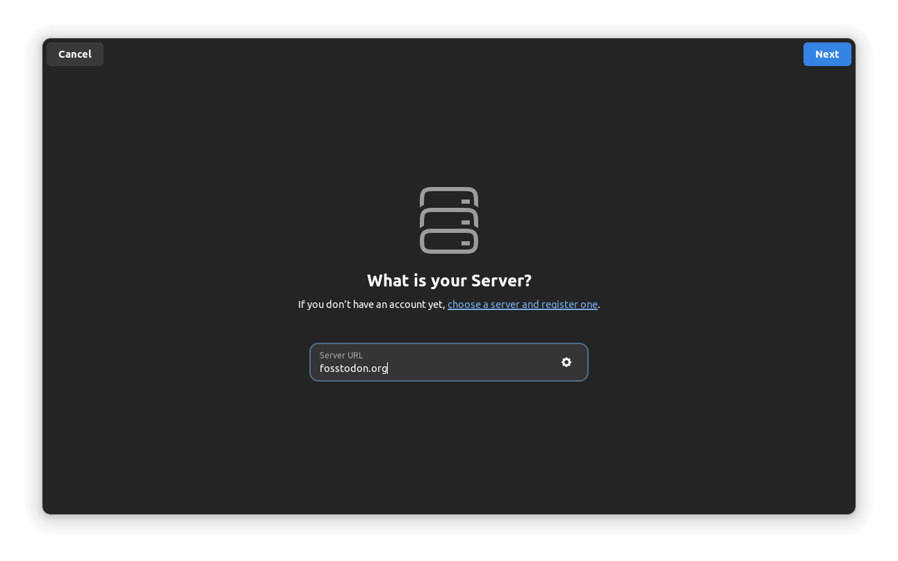
When I went ahead, a webpage popped up asking me to log in with my account, which was hosted on Fosstodon. I would have liked if there was a handy list of popular instances somewhere on the onboarding page for Tuba, but, it's okay.
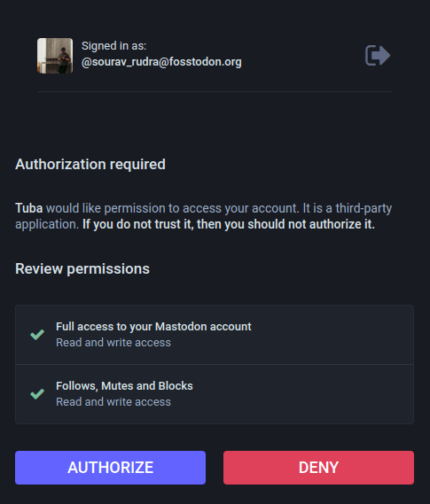
On the webpage, I authorized Tuba to the permissions shown above. Without those permissions, the app will not work.
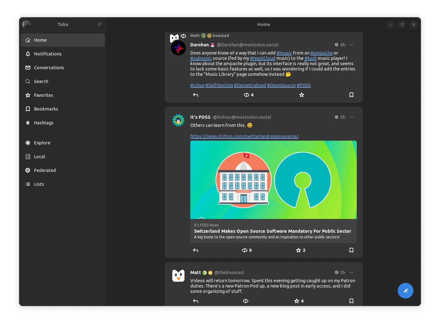
After that was done, I was taken into the “Home” feed, where I could see posts from the people and organizations I follow, it was identical to what one would find when using a web browser, albeit with some neat tweaks.
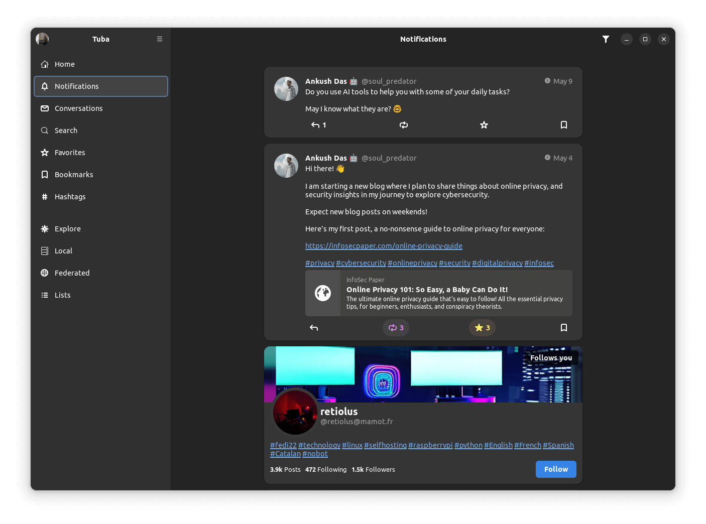
I then moved to the “Notifications” section, where my most recent notifications were shown to me, arranged neatly. I could also filter the notifications to sort them, the option for that was the funnel logo at the top-right of the app.
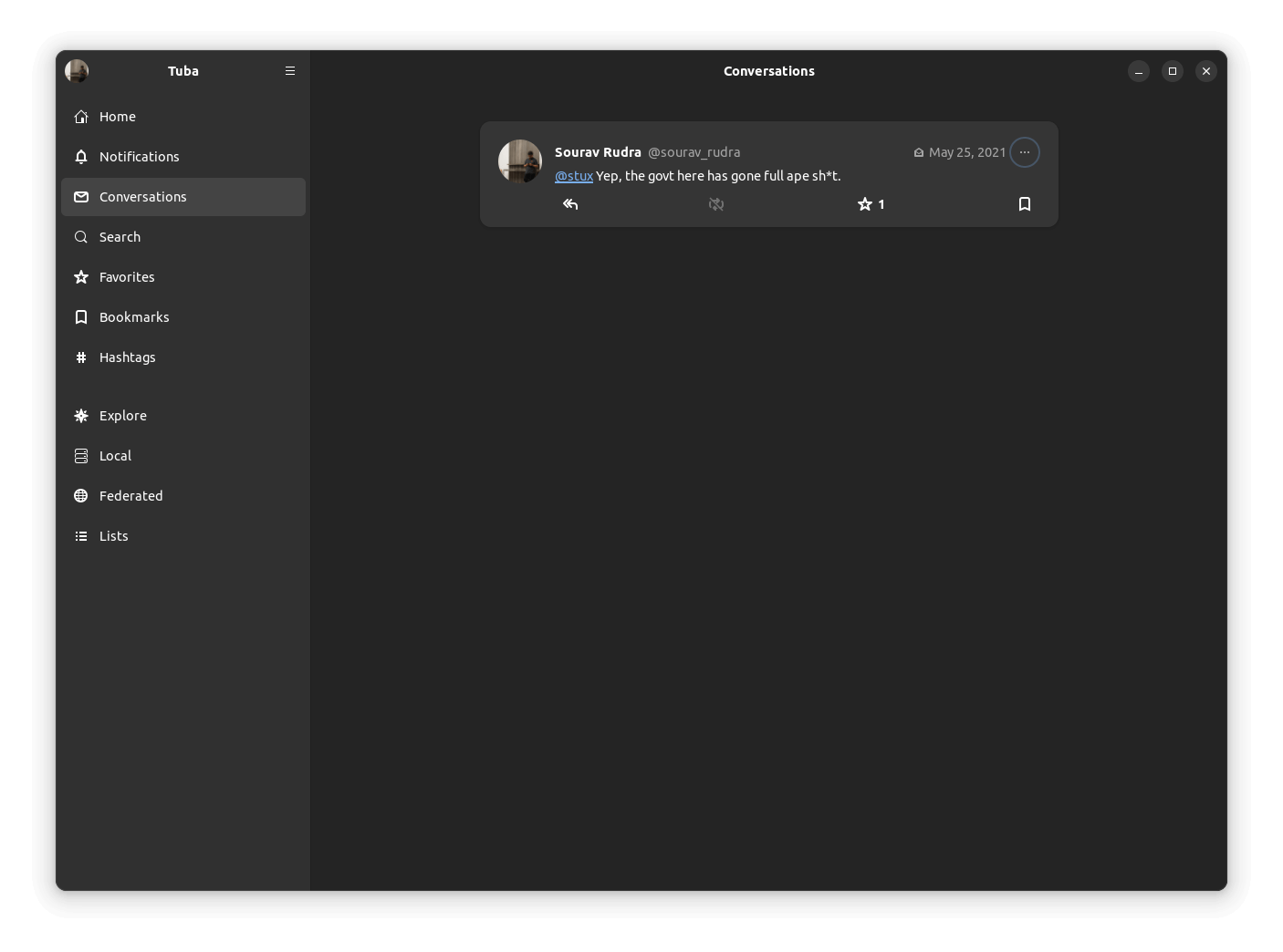
After that, I went into the “Conversations” tab, where I was able to see an old private mention I did on a post by stux back in 2021. This is the place where you will find such posts.
If you haven't figured by now, I am a bit dormant on my Fosstodon account. 😝
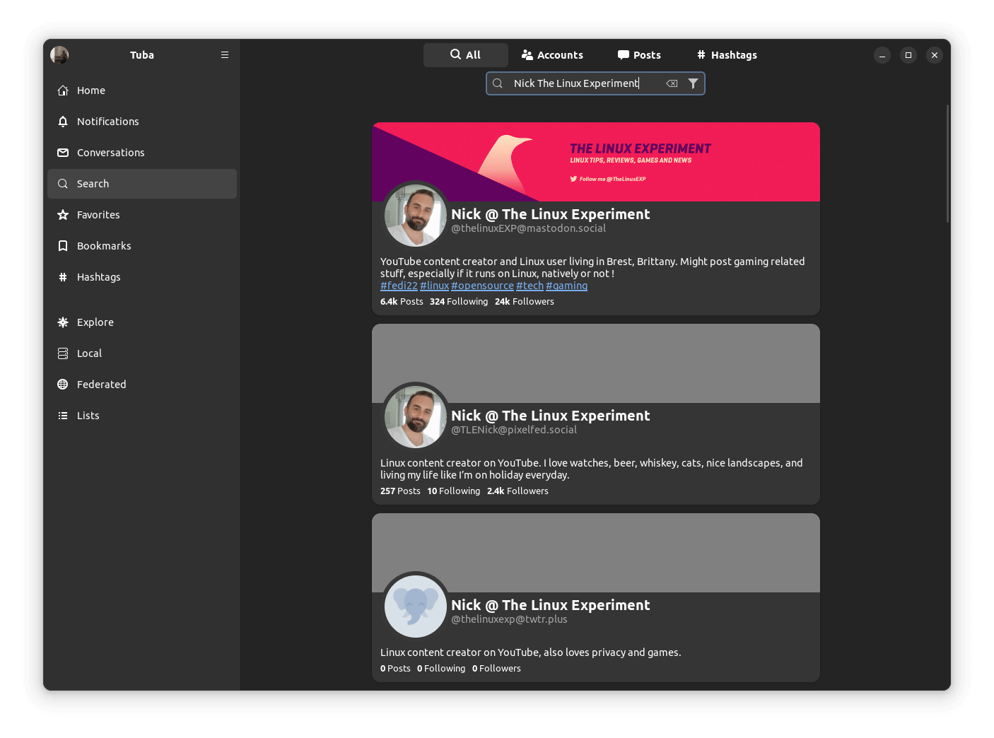
Then came the “Search” section, which was the one-stop place to search for people, posts, and hashtags.
As you can see below, I searched for Nick, from The Linux Experiment, and I was able to find two accounts, with the one on mastodon.social being the official one.
I then moved on to the “Explore” tab, which featured multiple sub-categories, in the first one called “Posts”, there was a random feed of suggested posts that covered various topics, including U.S. politics.
On the second one, “Hashtags”, there was a list of trending hashtags across the Fediverse, on the third one, “News”, there was a mix of different news articles, and on the last one, “For You”, I was shown a few suggested accounts to follow.
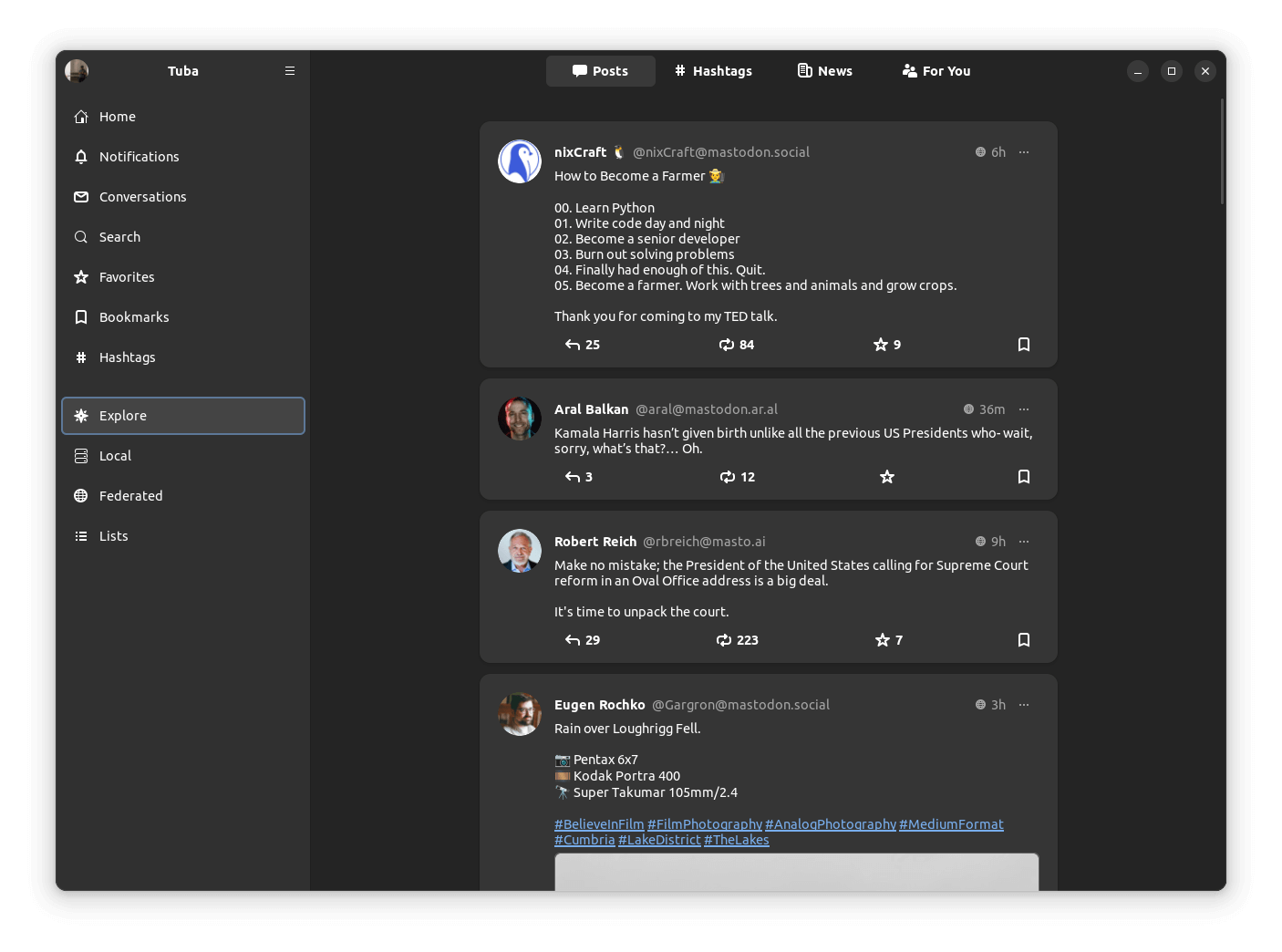
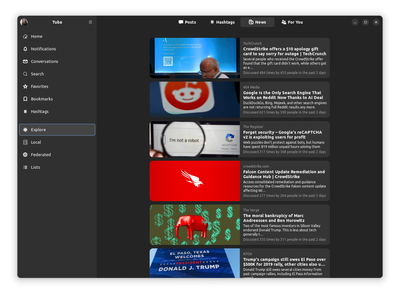
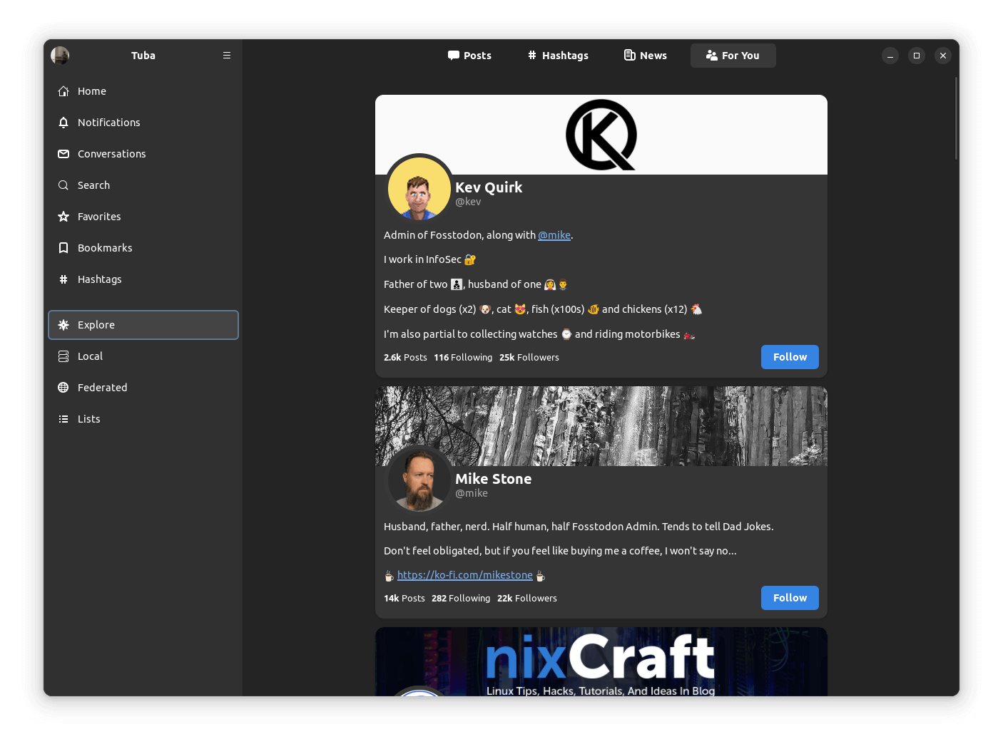
The various sections under “Explore”
All this left me wondering, how can I view my profile?
For that, I went into the hamburger menu at the top left of Tuba, where there was an option to “Open Profile”, it also had other helpful options such as to see follow requests, muted/blocked accounts, keyboard shortcuts and more.
There was also the option to add/remove profiles in the accounts' menu where It was weird to see that if I clicked on my name in it, the home feed would load up, instead of my profile.
But, when I click on the profile picture, Tuba would load my profile.
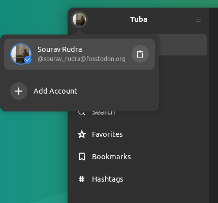
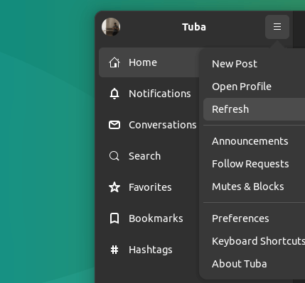
Add account and other options of Tuba
If you were wondering how a profile looks when using Tuba, this is how. 👇
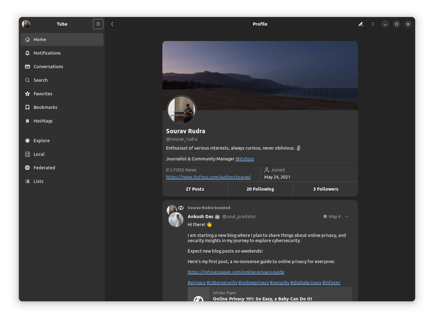
I then tried out the post editor, which can be accessed in various ways, such as from the hamburger menu, by clicking on the pen logo at the bottom-right when browsing the home feed, or by replying to a post.
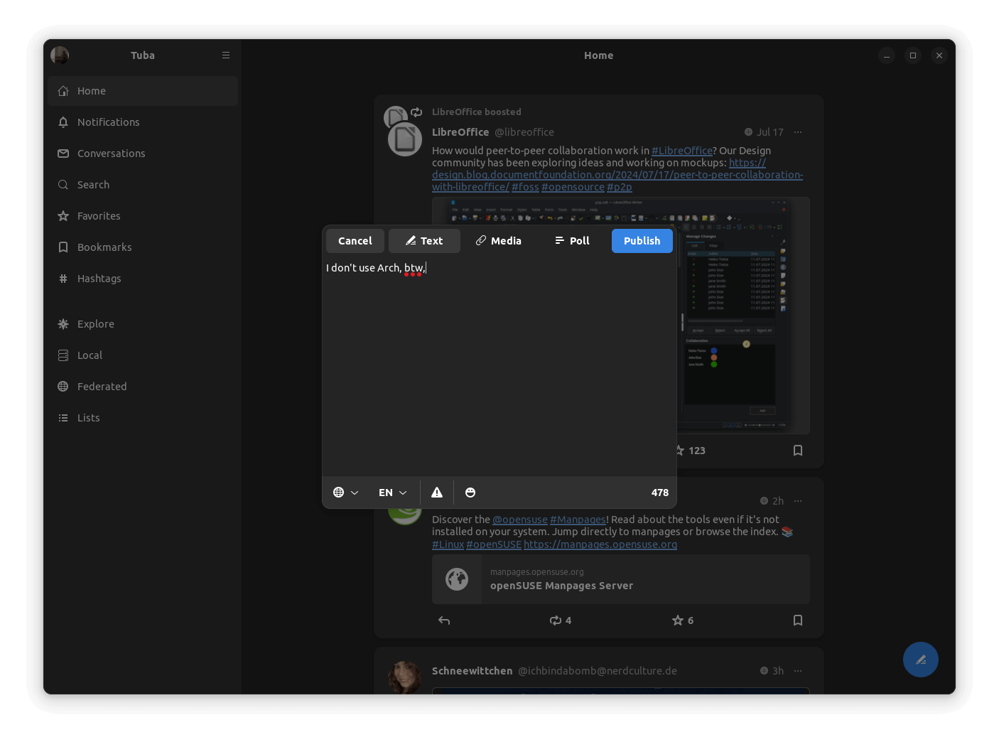
It was quite straightforward to get used to, with options for changing post visibility, adding media, creating a poll, adding emojis, changing the language, and placing a content warning.
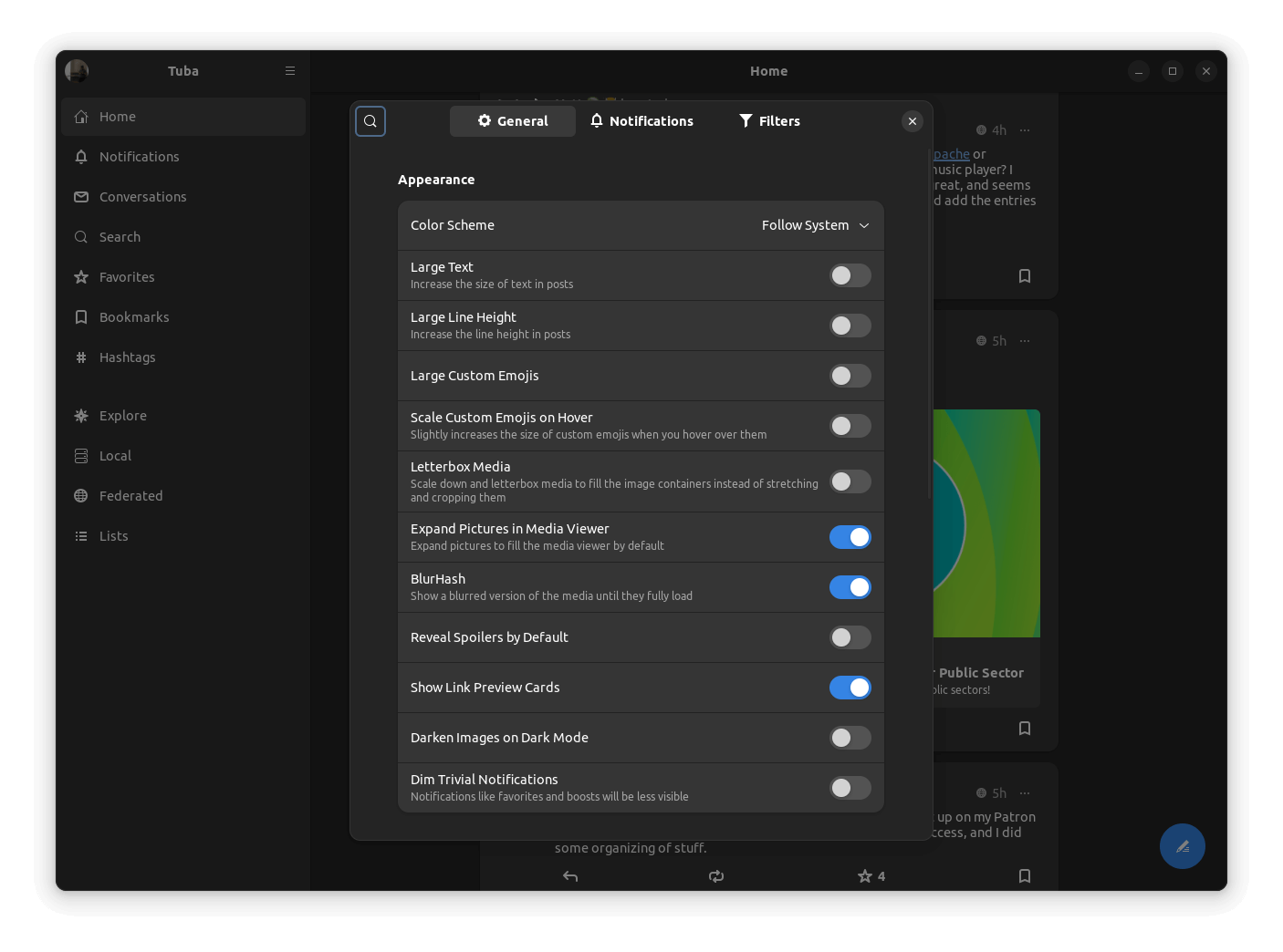
Similarly, the preferences menu had many options to tweak Tuba to my liking, but the default experience was good enough for me. There is a host of accessibility, notification, and filtering options under this.
Wrapping up, I will say that using Tuba was a great experience, and folks who want a native client experience should definitely go with it, the storage footprint is quite low too!
📥 Get Tuba
If you liked Tuba, or just want to take it for a test drive, then you can do so by getting it from the Flathub store.
Those looking to contribute to this project, or want to check out the source code, can visit its GitHub repo.
💬 Let me know if you have used Tuba before. I know many of our followers over on Mastodon do!
- Even the biggest players in the Linux world don't care about desktop Linux users. We do.
- We don't put informational content behind paywall. Your support keeps it open for everyone. Think of it like 'pay it forward'.
- Don't like ads? With the Plus membership, you get an ad-free reading experience.
- When millions of AI-generated content is being published daily, you read and learn from real human Linux users.
- It costs just $2 a month, less than the cost of your favorite burger.
Become a Plus Member today and join over 300 people in supporting our work.


