Jailtime for Retro Game Console Reviews? Italy’s Copyright Enforcement Sparks Debate
Italian YouTuber raided over handheld review, faces possible jail time.


There are several elements of the Ubuntu branding. For its fans, the orange and purple color symbolizes Ubuntu.
In addition to that, Ubuntu has logo that consists of a wordmark (ubuntu written in text) and a graphic symbol in orange color.

This orange ‘circle of friends’ is the identity of Ubuntu brand. It represents; freedom, collaboration, precision and reliability.
It’s actually the top view of a ‘huddle’ of three friends or team members. You may have seen such a huddle in sports.

But this is changing. As OMG! Ubuntu reported, Canonical has rebranded both the elements of logo, wordmark and the circle of friends.
In the old logo, the circle of friends was on the top right corner of the Ubuntu written in bold text.
The new logo changes that. The circle of friend is redesigned to make look smoother and it is placed on an orange column. The wordmark is also changed and uses a thinner font now. The U in Ubuntu is now in uppercase.
Interestingly, the small registered trademark symbol ® is no longer the part of the new logo.

Ubuntu noted this on the new design in the official blog post:
While it is important to have a respectful continuity with the previous Circle of Friends, the updated version is leaner, more focused, more sophisticated. It also makes a little more sense that the heads are now inside the circle, facing each other and connecting more directly.
You can see the animation of the new logo in this video:
This new design will be part of the upcoming Ubuntu 22.04 release.
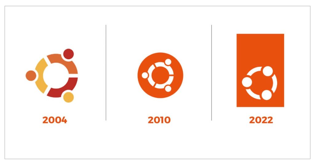
This is not the first time Ubuntu has been rebranded. When Ubuntu project was first created in the year 2004, the circle of friend had three colors; yellow, red and orange. It was redesigned in 2010 with the huddle in white and an orange circle around it.

The redesign comes thirteen years after the last one. While the new ‘circle’ looks good, I find the background rectangle a bit weird.
How about you? Do you like the new Ubuntu logo or you still love the old one? Do share your opinion in the comment section below.
Stay updated with relevant Linux news, discover new open source apps, follow distro releases and read opinions