Password managers are an essential tool to have in today's time. Nowadays, there are a ton of apps and websites that we have to access by providing usernames and passwords. It's challenging to remember all of them unless one reuses the same username and password across services, which, of course, is a cybersecurity disaster waiting to happen.
Some of the best password managers make this task simpler by providing you with an easy-to-use solution where you just have to read the instructions and set them up correctly.
One such option is Bitwarden, which caters to both individuals and enterprises with its array of privacy-oriented tools, with their password manager, being the flagship.
As a cross-platform offering, its browser extension was somewhat lacking compared to the others when it comes to the user interface. Luckily, that is changing now.
Bitwarden Browser Extension Redesign: What to Expect?

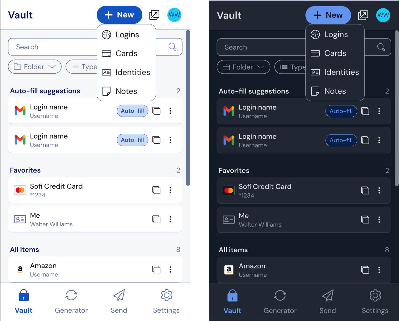
With a focus on improving navigation across the browser extension, Bitwarden has shared an early look at what we could expect from the upcoming redesign.
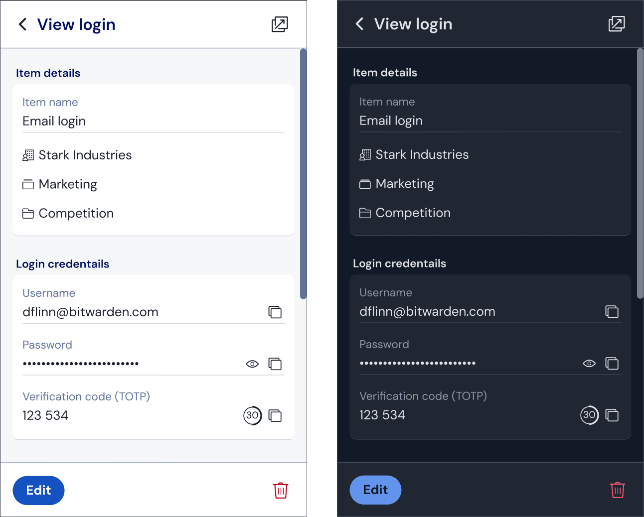
The most obvious change has been the overall visual look and feel of the extension, with consistent branding and colors being used across the interface. The layout has also been tweaked, with many things being reorganized for better accessibility.
The button for adding a new item to Bitwarden has been updated with a new button that says “+ New”, which also features a new drop-down menu with options for creating different types of items such as Logins, Cards, Identities, and Notes.

Similarly, the item detail view also receives many tweaks, such as the word “Website” being used instead of “URL” and related fields now being grouped together under separate sections.
And, finally, we have the “Tab” and “Vault” pages, which have been brought together to make searching for items simpler, and more accessible. Filters have also been integrated directly into the main “Vault” view itself.
I really like this change, as I didn't really see the point of having separate tab and vault pages whenever I used the extension. 😀
During the announcement, Bitwarden also added that:
One of the main reasons for redesigning the extension was to address the growing functional coverage of the user interface.
As Bitwarden rapidly added new features requested by the community and customers, thoughtfully redesigning the interface became more important.
It is very encouraging to see that Bitwarden takes the feedback of its community seriously.
Many companies (read big tech) fail to do so, implementing what they think is the right course of action for developing their product. In doing so, they alienate a large portion of their user base.
If you ask me, the browser extension was starting to look dated when compared to its mobile counterparts. It's great that it is finally receiving a rework.
After reading all that, you must be wondering: When's the release? 🤔
Well, Bitwarden has mentioned that this redesign is still under development, and will be rolled out over the coming months. With that in mind, my guess is that we might see this being released around July.
This revamp would bring Bitwarden right on par with Proton Pass (partner link), which has been taking big strides since its launch, adding new features and expanding support.
💬 Let me know your thoughts and release date guesses in the comments below!
Suggested Read 📖

- Even the biggest players in the Linux world don't care about desktop Linux users. We do.
- We don't put informational content behind paywall. Your support keeps it open for everyone. Think of it like 'pay it forward'.
- Don't like ads? With the Plus membership, you get an ad-free reading experience.
- When millions of AI-generated content is being published daily, you read and learn from real human Linux users.
- It costs just $2 a month, less than the cost of your favorite burger.
Become a Plus Member today and join over 300 people in supporting our work.


