Another Radical Move as Fedora Now Wants to Drop UEFI Boot Support on MBR
UEFI boot support for MBR could be removed in Fedora 43.
UEFI boot support for MBR could be removed in Fedora 43.

Microsoft faces growing rejection in Europe whereas open source software sees growing adaption.
A maps app that doesn't track you but lets you track your path on the map. A pathbreaking open source alternative.


If you have been using ProtonMail beta version, you may have noticed the user interface improvements they have been doing for years now.
While the old design was simple and effective, it did lack a lot of essential design choices and features.
For the very same reason, I preferred to use the beta version. But now, you no longer need to use the beta version to get a modern user experience. With the official announcement, ProtonMail has finally deployed the modern redesign for web users.
ProtonMail is one of the most secure email services for privacy-oriented users.
However, as much as one would love the privacy-centric features, the user experience matters a lot. To be honest, it was not a great experience. But that changes now with the redesign for the web.
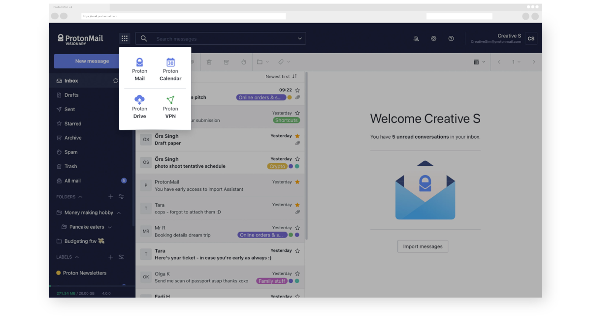
The refreshed look that ProtonMail offers is a clean and modern user experience that just feels good to navigate around. You can look at the official video above to get an idea, but I’ll mention a few key changes as well.
With the modern design, ProtonMail now offers multiple layouts and themes to choose from. I like the dark theme (Carbon), but every theme offered looks attractive.
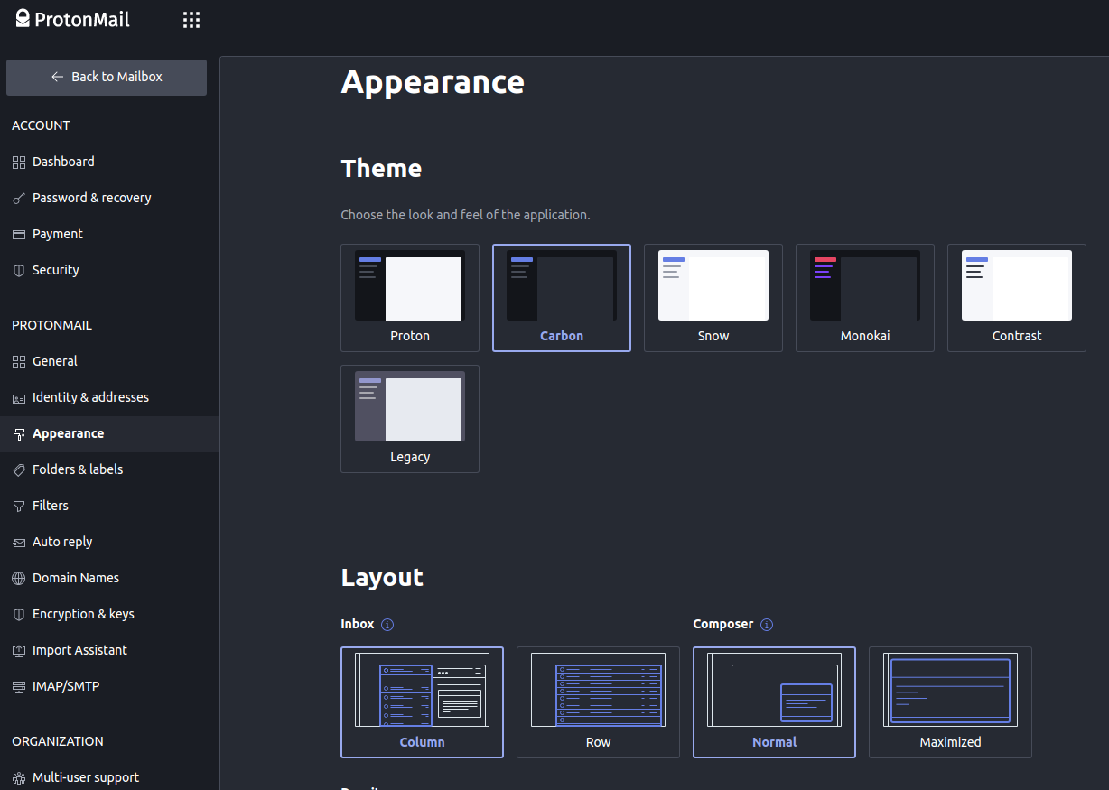
The new app selector is also a significant improvement to let the web users access other ProtonMail services from a single place.
In addition to all the visual goodies, you will also find the following key changes:
The fact that your logged-in session is saved now — makes things so much more convenient. With the old system, you had to re-login every time you loaded ProtonMail in a different browsing session, but no more.
As you navigate your way through the web portal, you will notice several subtle and noticeable visual differences from the old design, as mentioned in the announcement.
You can start experiencing the new design by simply visiting the ProtonMail website.
It is quite a refreshing experience, I must say, unlike Firefox’s redesign for some users.
What do you think about the latest ProtonMail redesign? Do you like it so far?


A new privacy-first search engine has arrived!

Proposed privacy law changes, if passed in parliament, threaten Switzerland's reputation as a privacy haven.


GNU Taler, the privacy-preserving digital payment system, is now Swiss ready.

Nextcloud is not happy with what Google is doing.
Stay updated with relevant Linux news, discover new open source apps, follow distro releases and read opinions