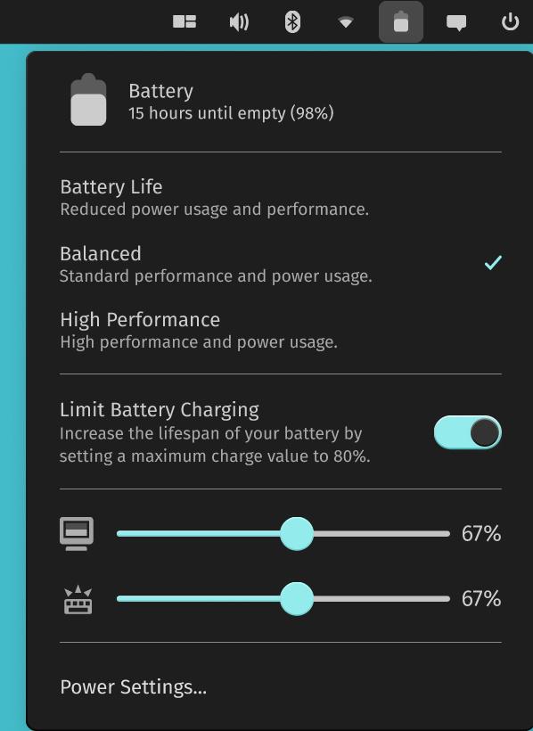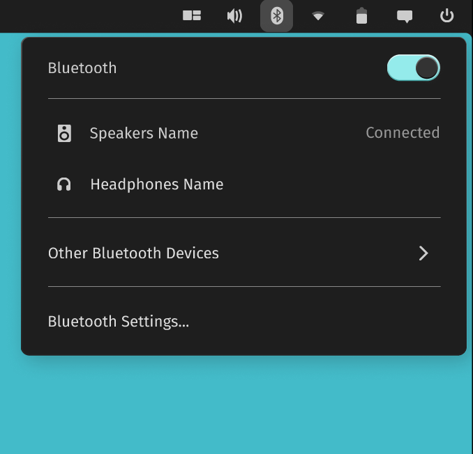
The development work for System76’s exciting new Rust-based COSMIC desktop is now underway.
While we already tried it out using the early code available, we get to see more of it now. Thanks to some prototypes available in its GitHub repository and a Figma document, we get to see more of it!
Notably, we get to see the top panel and the system tray as you would expect in the COSMIC desktop.
It is still a work in progress and is subject to change.
Top Panel in COSMIC Desktop
Pop!_OS relies on GNOME extensions to offer more functionalities through the top panel or the system tray icons.
With the upcoming Rust-based COSMIC desktop, it looks like they’re creating new applets that blend in with the current look and offer more functionality out of the box.
Eduardo Flores, a developer, breaks it down to learn the key differences and how System76 aims to make it work.
And, this is what makes it more interesting:
Looks like System76 is moving away from the traditional “extensions” and plans to design an API for third party applets, this is similar to what KDE, XFCE and others are doing.
This is exciting news, this will make COSMIC a much more powerful desktop environment, making it extendable and customizable.
Also, it seems that these applets can also be placed in the dock along with the top panel. We’ll have to see more of it in action in one of its future beta releases.
Here, let me highlight the fundamental changes observed from the mockups available:
1. Sound Applet
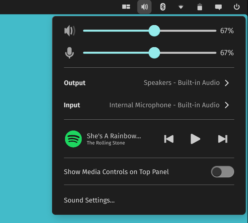
Compared to what we have now, COSMIC aims to add granular controls like selecting Input/Output devices, option to toggle media controls on the top panel, control playing media, and access the sound settings.
While the mockup doesn’t show album art, it will include it down the road before release.
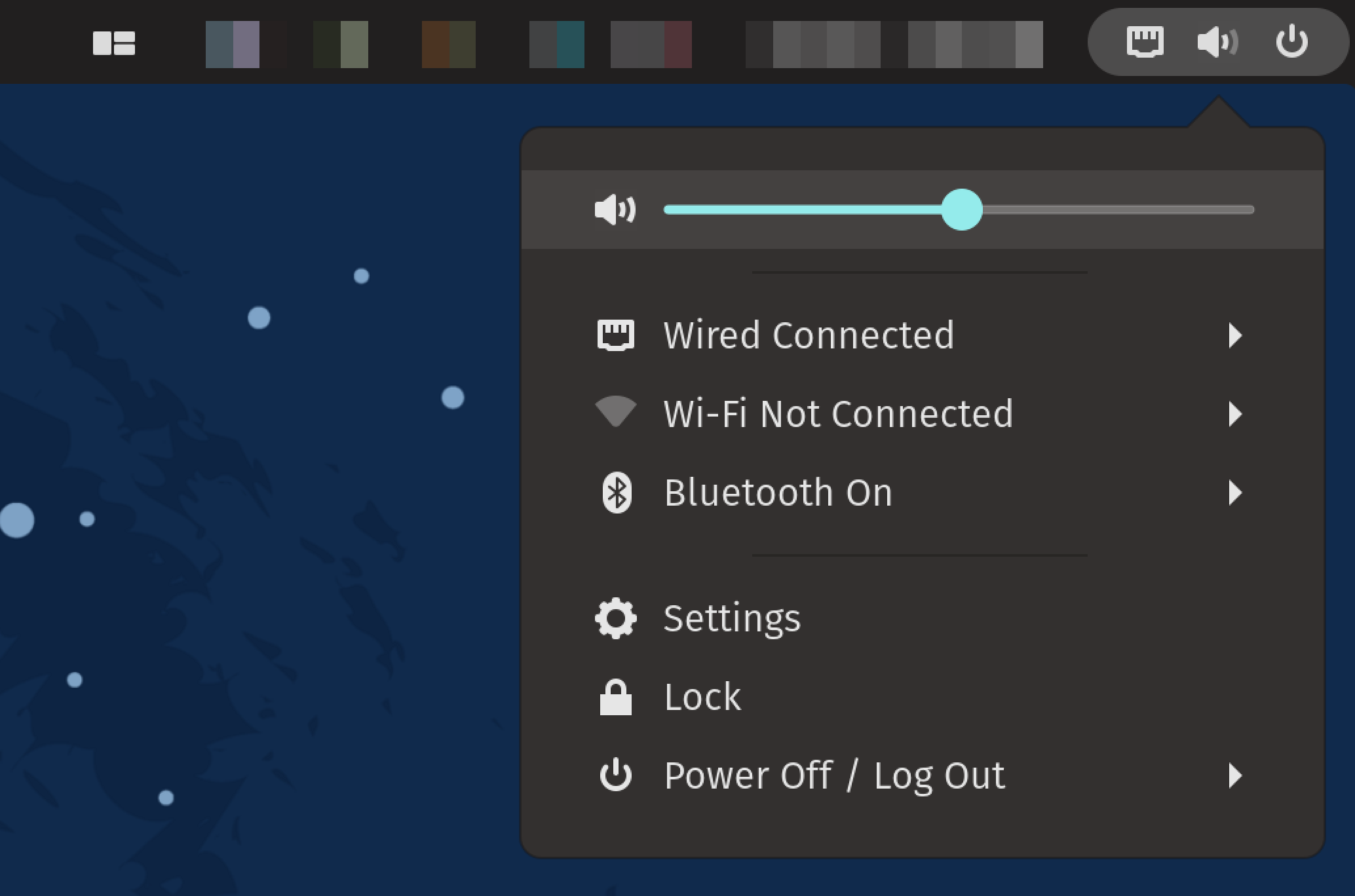
For reference, here’s what the Pop!_OS top panel options look like now:
2. Power Applet
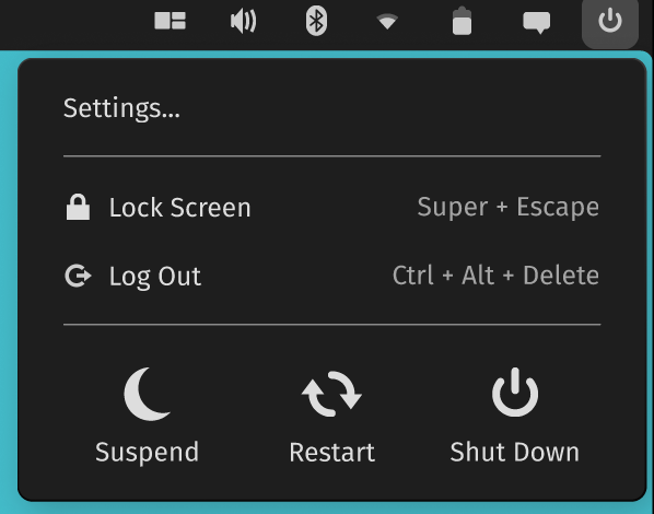
It is good to see a dedicated power button to quickly access system settings, lock screen, and log out.
Also, the buttons for suspending, restart, and shut down should improve usability, eliminating any extra clicks to shut down the computer.
3. Network Applet
While you can easily turn on/off the Wired/Wireless networks, a separate window pops up to select Wi-Fi network and enter the password taking up the entire screen.
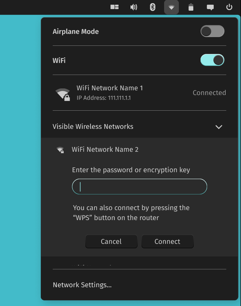
But, it looks like we can finally type in the password, connect to available wireless networks, and retry the failed connection without getting distracted from the active window. All that happens from the network applet on the system tray, as shown in the screenshot above.
Similarly, you get to see more information about your wired connection, including the IP address and speed.
4. Date, Time, and Calendar Applet
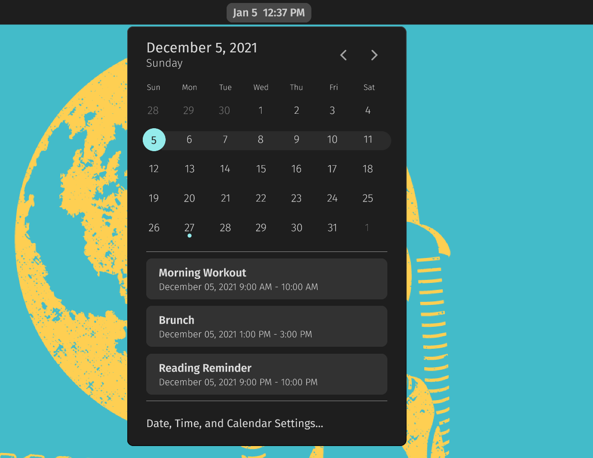
The most important calendar applet looks much more functional and informative. The notification area no longer resides here (considering it has a separate applet now), making it a cleaner experience to focus on what you want here.
Several subtle visual enhancements like accent color to highlight a row in the calendar should make it easy to understand.
5. Notifications Center
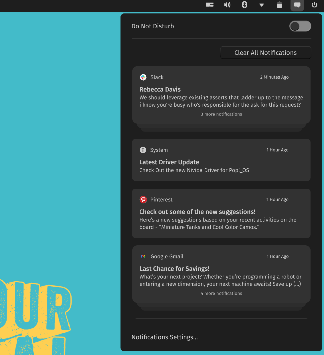
As I mentioned earlier, notifications now have a separate space. The notification applet will stack up all notifications and allow you to expand them if needed or clear them all.
We still have the Do Not Disturb toggle and quick access to notification settings.
6. Graphics Mode Applet
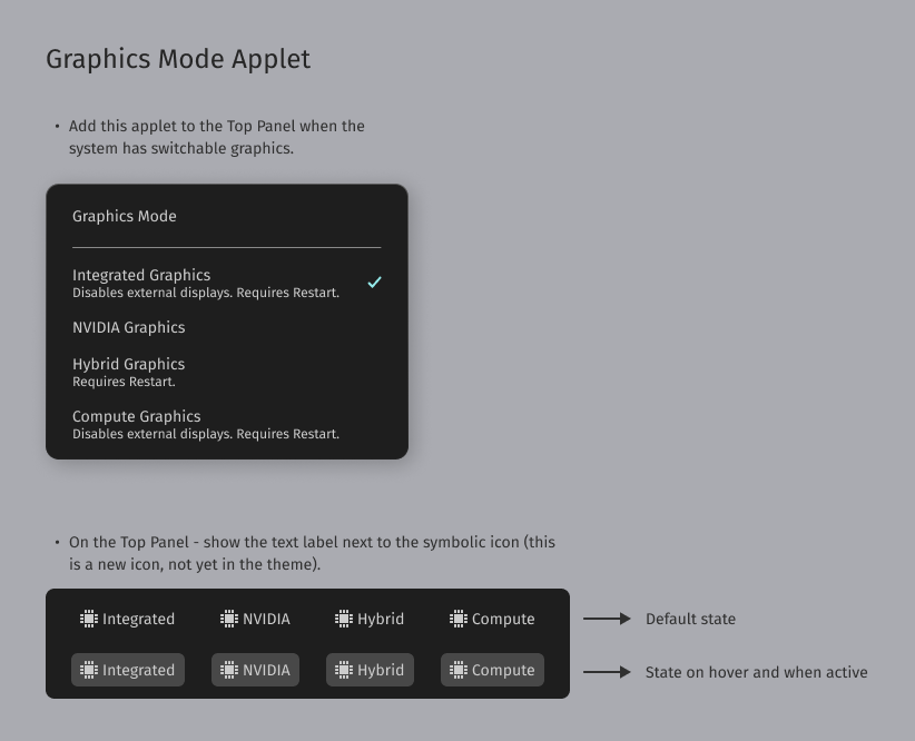
This should be incredibly useful for laptop users, making it seamless to switch between graphics and keep an eye on what’s active.
In addition to all these, a Bluetooth applet, a battery power mode applet, and a few more things like the ability to change input language or input source.
Given this is the first look for the top-panel of Rust-based COSMIC desktop, it looks like we have a lot to go through!
Closing Thoughts
Overall, System76 is gearing up to give us a highly customizable yet simplified version of the COSMIC desktop.
And all of that should contribute to a unique desktop experience. Of course, you will have to say goodbye to GNOME next year.
What do you think? Let me know your thoughts in the comments below!
- Even the biggest players in the Linux world don't care about desktop Linux users. We do.
- We don't put informational content behind paywall. Your support keeps it open for everyone. Think of it like 'pay it forward'.
- Don't like ads? With the Plus membership, you get an ad-free reading experience.
- When millions of AI-generated content is being published daily, you read and learn from real human Linux users.
- It costs just $2 a month, less than the cost of your favorite burger.
Become a Plus Member today and join over 300 people in supporting our work.


