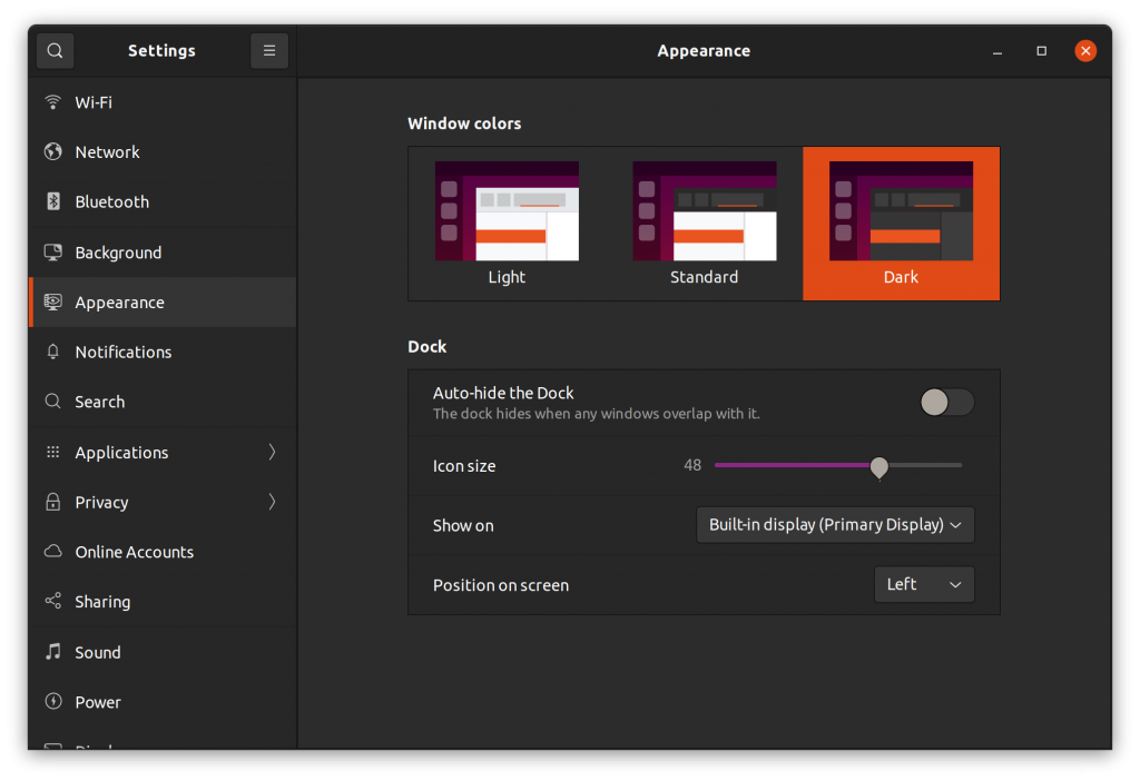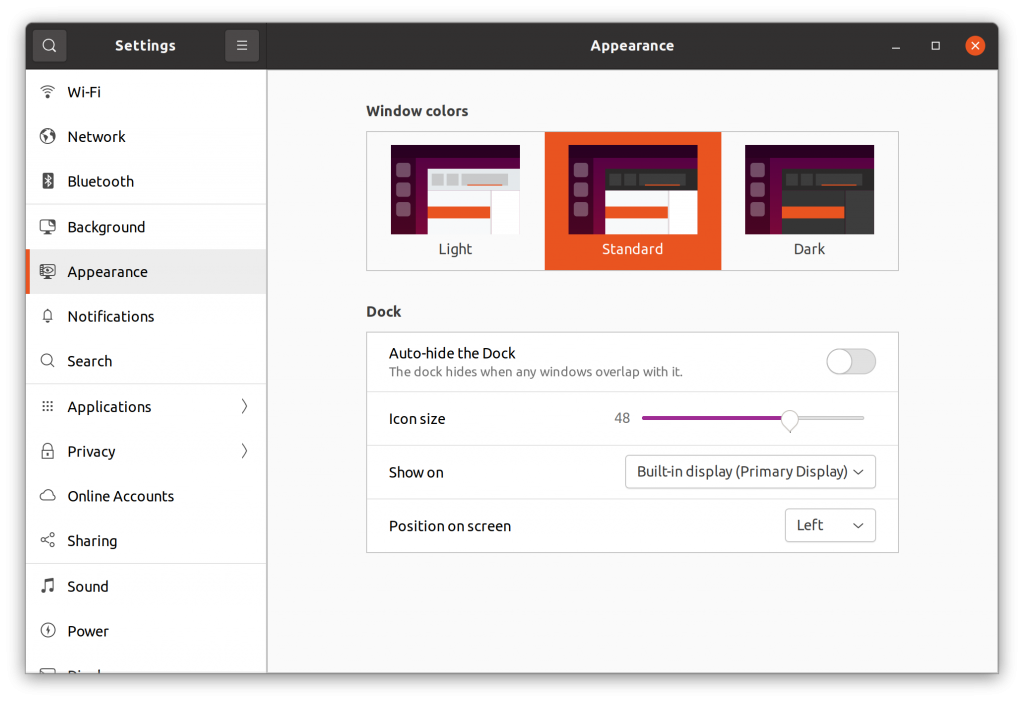
Ubuntu’s default “Yaru” community theme is an excellent choice. However, Ubuntu’s team has been tweaking it for a while since Ubutu 19.10 to match their branding and offer a good-looking experience.
I liked the default themes available with Ubuntu 20.04. Up until now, you got standard, light, and dark theme options to choose from.

But starting with Ubuntu 21.10, you will no longer find the “Standard” (or mixed) theme available to pick. It all comes down to two choices that include light and dark theme only.
Now, why is this happening? What exactly is the Standard theme offering now?
Here’s what you need to know …
Ubuntu’s Standard Theme is Problematic

If you have used Ubuntu, you probably know that Ubuntu’s Standard theme refers to a mixed theme. It features a dark window bar (or the titlebar of applications) and the rest follows a light theme pattern.
With Ubuntu and GNOME’s default theme color conflicts and lack of theming API for GTK (and Gnome shell), it is already problematic to customize and work on Ubuntu’s desktop theme.
Moreover, GTK 3 and GTK 4 do not support having a separate background color for the headerbar from the rest of the window. Hence, it is tough to keep bug-free implementations for every GTK application.
And that is the reason the Yaru community design team recently proposed to remove the mixed theme.
Ubuntu’s team has agreed to this decision and the change has been merged. You should no longer find the mixed theme in Ubuntu 21.10 but only the dark and light themes as your option.
In other words, “Yaru” will be the light theme, and “Yaru dark” will be the dark theme when using GNOME Tweaks. There will be no “Yaru-light” anymore.
Will They Bring Back the Mixed Theme?
Unless there are changes in the upstream — GNOME providing a theming API and GTK 3/4 supporting more customizability for headerbar, the mixed theme is gone for good.
So, with Ubuntu 21.10 and any future releases, you get fully light and fully dark themes, which should offer a seamless user experience across any GTK application.
A Potential Rebranding in Ubuntu 21.10
While the Brand and Visual team at Canonical agreed to the default Yaru theme changes, they also want to work closely with the Yaru community design team for the upcoming rebranding, as mentioned by a designer in this GitHub thread:

So, what exactly do we know about the upcoming rebranding for Ubuntu 21.10? Nothing yet.
But considering that Ubuntu 20.04 shaped up with attractive branding and visuals, I’m excited about this one. Most probably, the default color scheme will change – but what what will it change to?
Let’s wait for that! Feel free to share your thoughts on this development on Ubuntu’s future design in the comments below.
First noticed at: OMG! Ubuntu
- Even the biggest players in the Linux world don't care about desktop Linux users. We do.
- We don't put informational content behind paywall. Your support keeps it open for everyone. Think of it like 'pay it forward'.
- Don't like ads? With the Plus membership, you get an ad-free reading experience.
- When millions of AI-generated content is being published daily, you read and learn from real human Linux users.
- It costs just $2 a month, less than the cost of your favorite burger.
Become a Plus Member today and join over 300 people in supporting our work.


