Open Source Photo Manager digiKam Improves its AI Offerings
Better face recognition workflow, improved GPU support, and AI auto-rotation added.
Better face recognition workflow, improved GPU support, and AI auto-rotation added.

Fedora's 32-bit removal plan has been dropped due to intense backlash from the community.
Orange Meets, now with E2EE.


GNOME 3.38 was the previous major release that came equipped with many improvements and a major performance boost. With the next release, GNOME 40, we’re getting major changes to the user interface along with performance boosts.
In case you were out of the loop, you might want to know that the GNOME team changed their version classification to a new system to avoid confusion with GTK 4.0 release and others. Now, every six month, a new release will increase the major version number by one like — GNOME 41, GNOME 42 and so on. The stable point releases will be like this — GNOME 40.1, GNOME 40.2, GNOME 40.3,etc.
Now that GNOME 40 is finally here, let us take a quick look at what’s new.
The developers have been focusing on improving navigation across the desktop environment by providing a better navigation experience that is more natural and intuitive.
For example: If you are a laptop user using the touchpad on your device, you can make use of “Touchpad Gestures”. Going up and down on the touchpad takes you in and out of the activities overview and app grid screens, left and right switches you between workspaces.
Even if you’re not a laptop user, you can still use these gestures by using the keyboard shortcut: Super+Alt+↑ or ↓ or ← or →.
And, if you’re using a mouse, you can navigate using Super + Alt + Scroll.
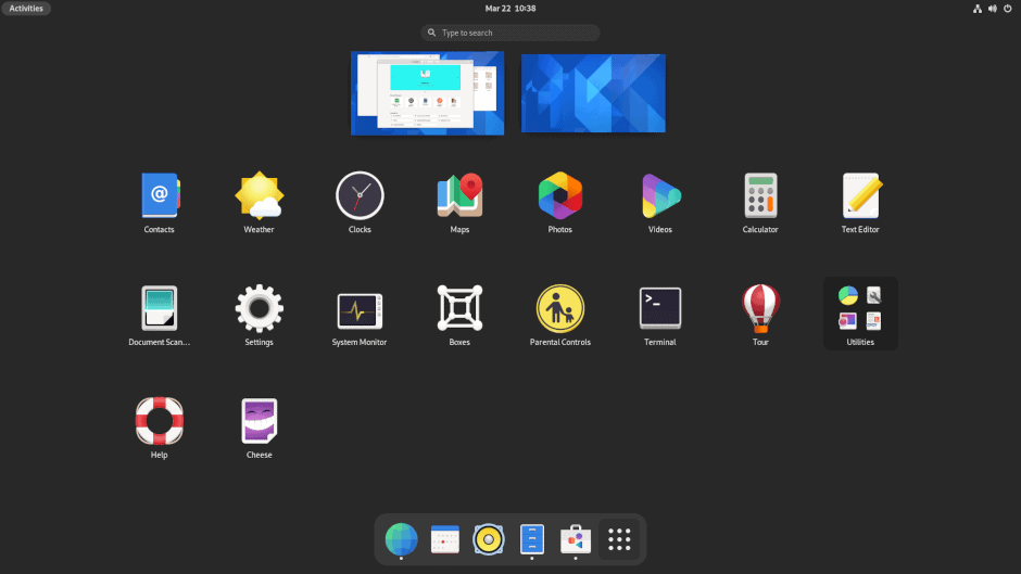
The Activities Overview has been revamped significantly. The workspaces are now arranged horizontally and shown in a zoomed out manner, with running applications floating on their respective workspaces. The other workspaces appear from left to right, users can scroll or pan through them.
Sure, you may not like this as it could break your workflow for now. But, GNOME developers mention that they changed the dock position and activities overview for a better flow of work. It should make the experience more seamless.
The app dock is now horizontal rather than being vertical, many existing users may find it uncomfortable. The devs have no plans to give an option for rolling back to the old vertical layout. But, if you want to use the old layout, then you may have to use an extension to achieve that.
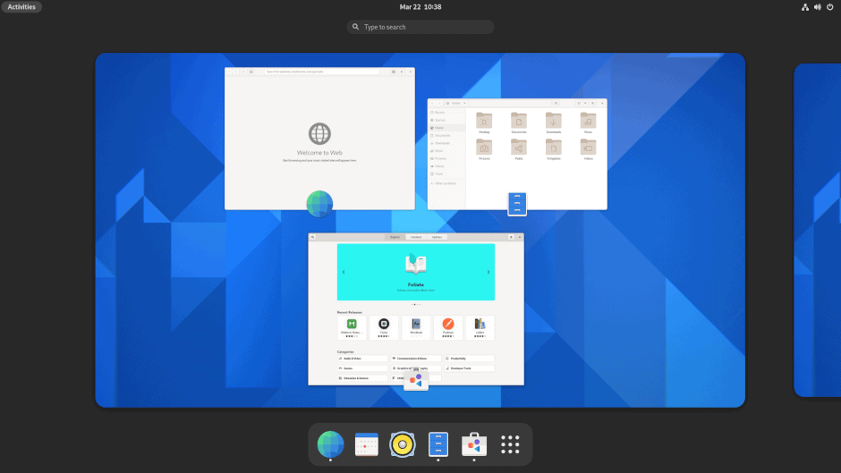
Workspaces are also getting a refresh. Not just limited of the horizontal experience of workspaces, but it will be much easier to switch into different workspaces and the transition should be quicker when switching.
GNOME 40 will display the workpspaces in the primary display by default, but it also supports navigation of workspaces in the secondary display if you have a multi-monitor setup.
So, that’s a good thing.
However, with multiple horizontal displays, the layout of the workspaces might clash, and you will have to eventually adjust with the design change.
Previously, we had all the active running apps and the favorite app icons in the dash (or dock).
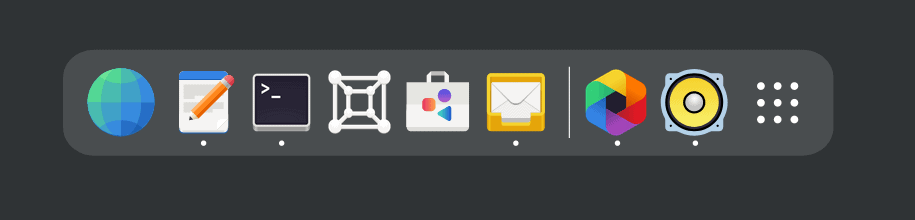
Of course, we’ll still have them there but with GNOME 40, it keeps the running apps and favorites separate for easy access.
You will find feature additions and some subtle re-designs in core applications.
For instance, the much-awaited feature of showing file creation timestamps is now a reality, as you can see in the screenshots below.
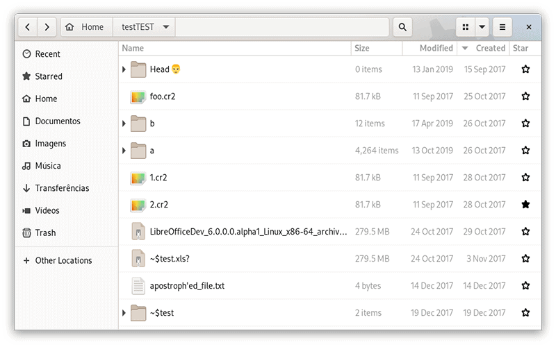
Now you can easily have a column with the “Creation” date. You may have to manually add the column if you need to check the creation date for every file.
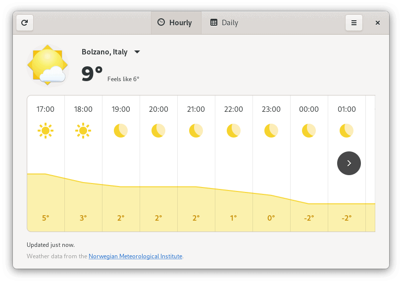
Similarly, the weather app has received a redesign to show more information:
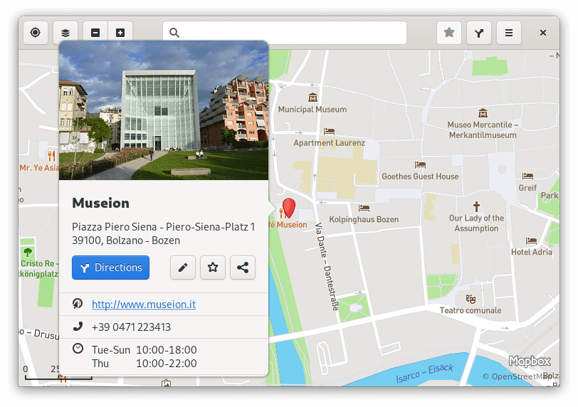
You can also explore the addition of a new tab in Epiphany browser on our original coverage. Not to forget – Maps now features richer information cards for meaningful experience.
Not just limited to the desktop experience overall, one of the key focus was also to simplify the development cycle and improve the documentation of GNOME shell extensions.
When that happens, you may have to push your extensions to the repository on GitLab to find it available on extensions.gnome.org. Initially, I thought this was a change in effect along with the release of GNOME 40, but it might take one more release cycle before that happens.
If you’re an extension developer, you might want to read the official blog post for porting your extensions to GNOME 40.
To know more about GNOME 40, you can refer to the official release notes or get the release highlights on GNOME 40 website.
Even though the visual changes in GNOME 40 sounds exciting, only time will tell how refreshing it is when you end up using it.
As of now, you can try it on Fedora 34 beta or wait for the final release to try GNOME 40. Or, you can simply grab a nightly build of GNOME OS using GNOME Boxes app and test it out for yourself as Ankush did for the YouTube video.
What do you think about the changes that come with GNOME 40? Are you a fan of it? Feel free to share your thoughts in the comments below.
It's FOSS turns 13! 13 years of helping people use Linux ❤️
And we need your help to go on for 13 more years. Support us with a Plus membership and enjoy an ad-free reading experience and get a Linux eBook for free.
To celebrate 13 years of It's FOSS, we have a lifetime membership option with reduced pricing of just $76. This is valid until 25th June only.
If you ever wanted to appreciate our work with Plus membership but didn't like the recurring subscription, this is your chance 😃


Is this the end of fragmentation for Linux?


It took its time, but GNOME 48 is finally here with some rather interesting changes.
Stay updated with relevant Linux news, discover new open source apps, follow distro releases and read opinions
