
GNOME 43 packed in some useful UX upgrades, and now GNOME 44 release is around the corner.
What are the exciting changes this time? Is it a significant upgrade that you should try?
Let us look at the features of GNOME 44.
GNOME 44: Feature Highlights
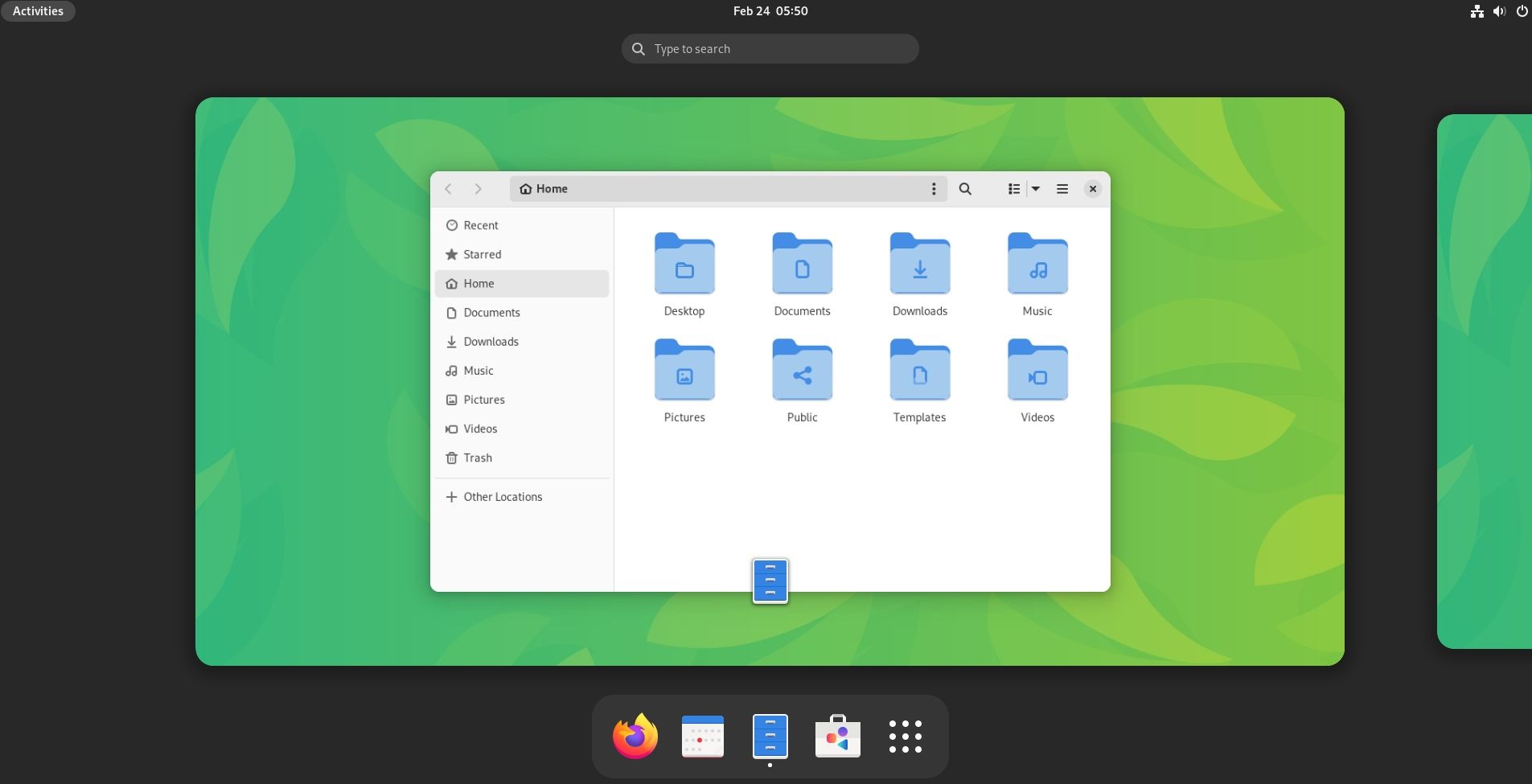
GNOME 44 brings in quite a few impactful changes. Some of the key feature updates include:
- Quick Bluetooth selection menu
- Visual changes to the lock screen/login window
- Additions to the quick settings menu
- Settings improvements
- Updates to the File manager
1. Quick Bluetooth Selection Menu
The quick settings panel lets you view and manage the Bluetooth devices connected to your system.
When writing this, the functionality did not work well with Fedora 38 (testing build) with GNOME 44 beta. But here's what it should look like:
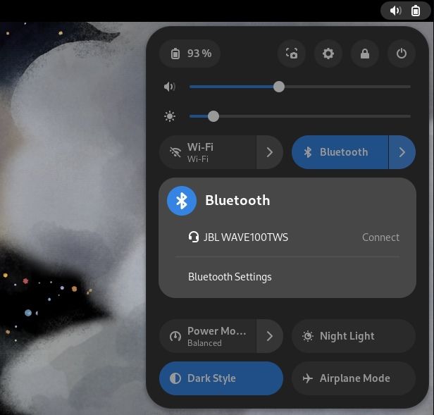
Previously, you were limited to just looking at the connected device, with no quick toggles available. Now, you can connect/disconnect with a few clicks.
However, for a new device pairing, you must head to the Settings menu as usual.
2. New Lockscreen / Login Screen
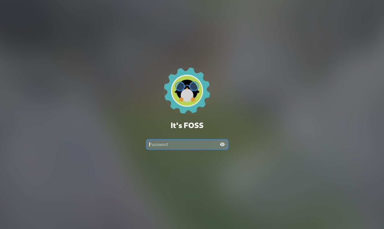
With the new lock screen and login window, you get a bigger user avatar and subtle changes to other elements, like increased font size for the clock (when you do not have the login field highlighted).
3. Screenshot Icon in the Quick Settings
There are a couple of changes to the quick settings; one of them is the addition of a screenshot icon to the left of the settings icon.
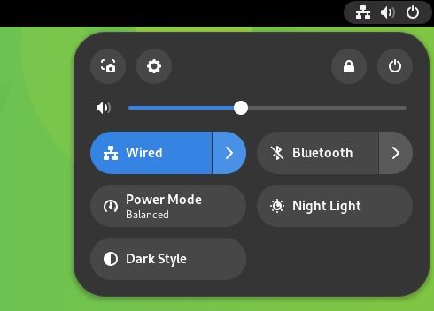
It gives you a quick shortcut for a screenshot for users who prefer to navigate things by the cursor. Also, it makes good use of the blank space before.
4. Thumbnail View With GNOME File Picker
One of the most exciting GNOME developments we heard about last year was the thumbnail view support for GNOME's file picker.
Choosing an image based on the file name alone was inconvenient, but we GNOME users managed.
With GNOME 44, you can identify the file clearly before selecting it for several tasks.
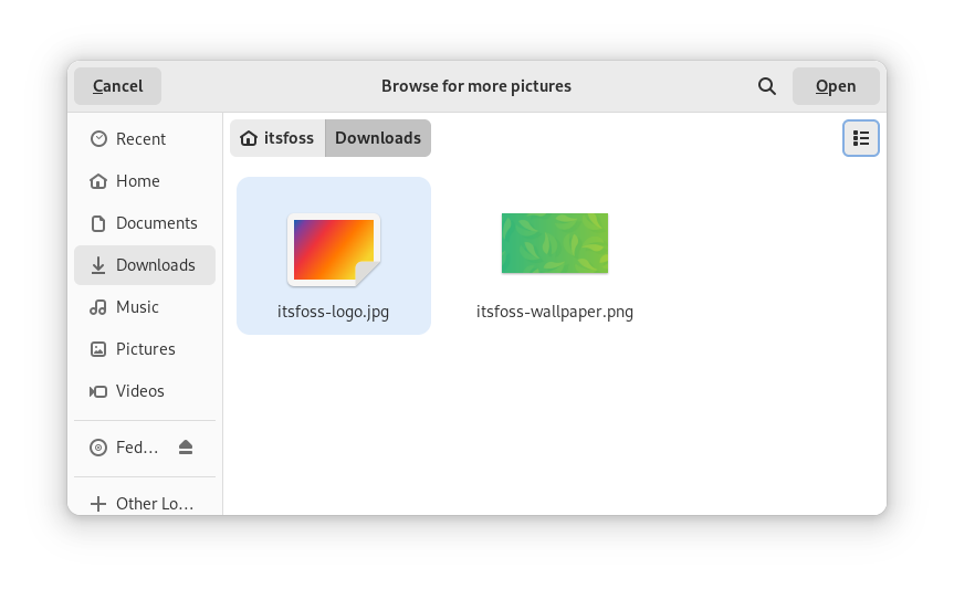
You can toggle the list-grid view to enable the thumbnail view.
Some observations: I found the option when changing the user icon while using GNOME 44. However, when I tried to upload a file on a website through the web browser, the file picker did not offer the grid view.
5. Settings Improvements
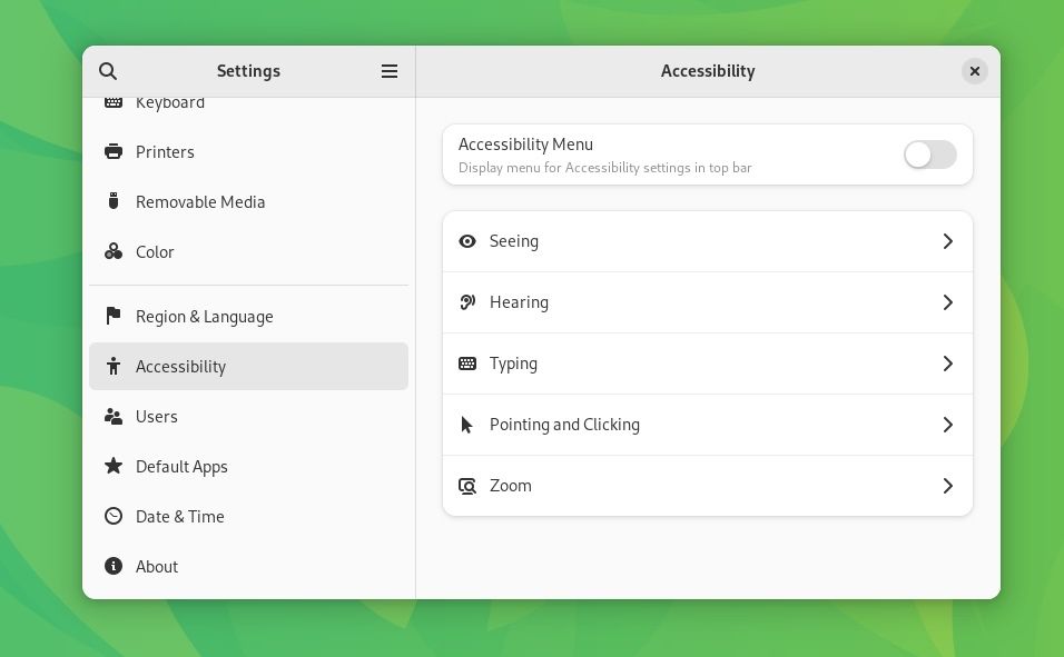
The Settings area has received numerous subtle changes and a bit of visual makeover to re-organize things for clarity.
For instance, the Accessibility panel was redesigned to provide a more modern navigation experience. Other panels could follow this pattern of change in the upcoming GNOME releases.
You can now share Wi-FI passwords through a QR code. Not to forget, the mouse/touchpad UI has been improved, as you can see in the screenshot below:
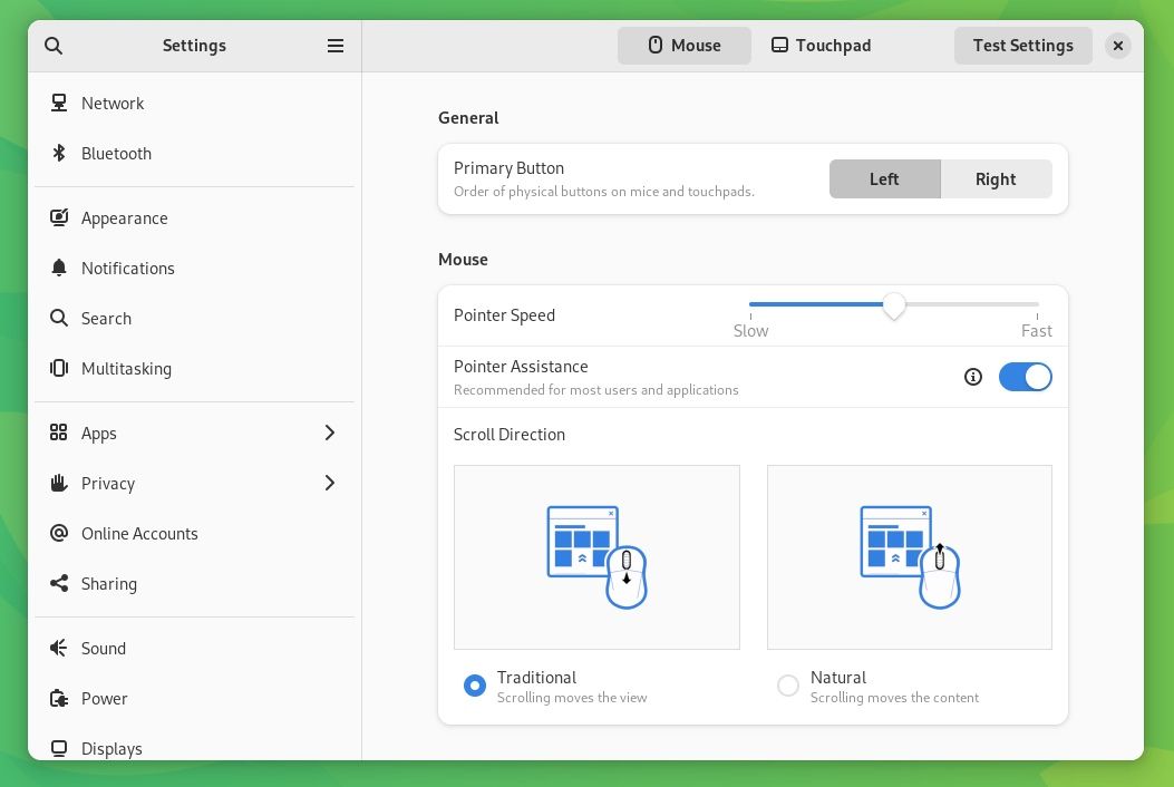
This looks pretty neat.
Other changes include polishes and smaller improvements; like "Date & Time" panel is now more mobile friendly, and the ability to add a Wireguard VPN connection
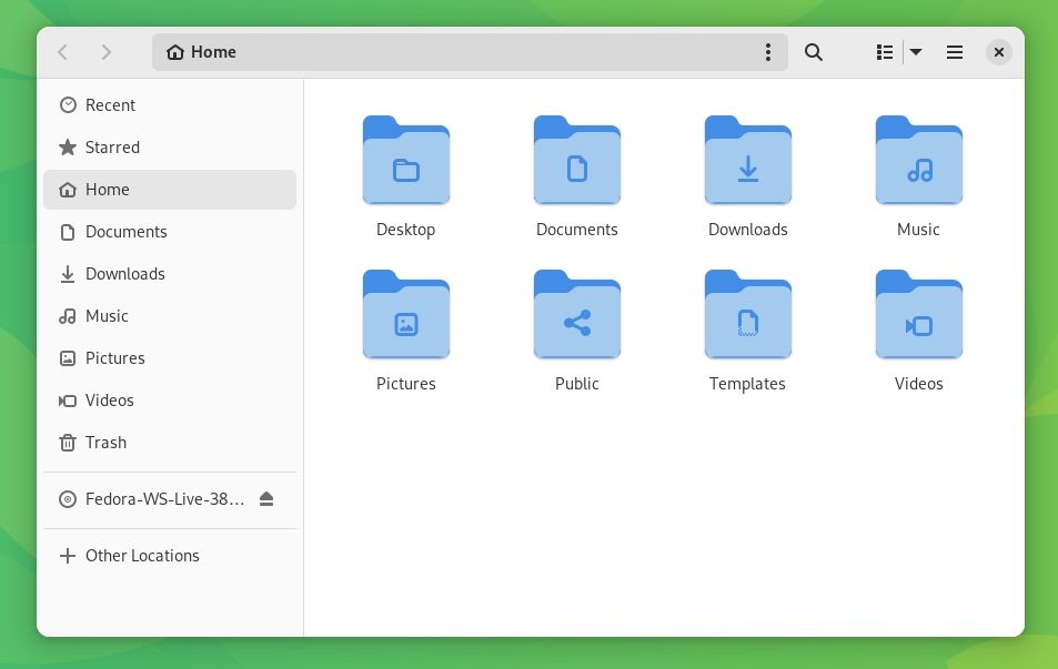
6. Refinements to File Manager
Most of the major Nautilus changes landed with GNOME 43.
So, with this release, you can expect minor updates to the icon size, improved performance while searching, and more technical stuff.
7. Monitor Background Apps
With GNOME 44, the applet indicators (kind of) are coming back, as we reported earlier.
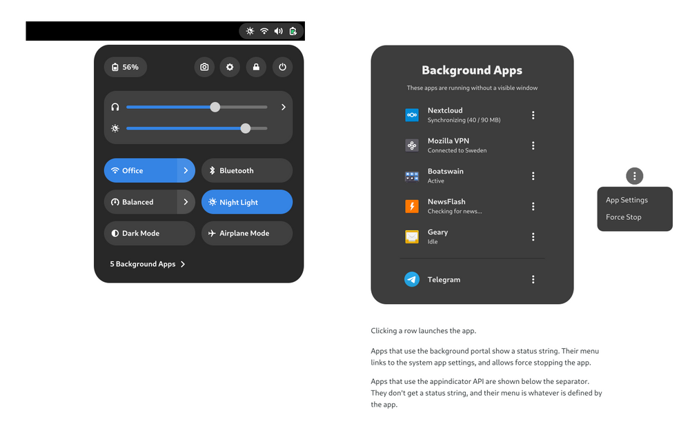
The quick settings will highlight the apps running in the background. You are not limited to listing it; you can manage it to some extent, like closing the app or accessing a certain setting.
🛠️ Other Essential Changes
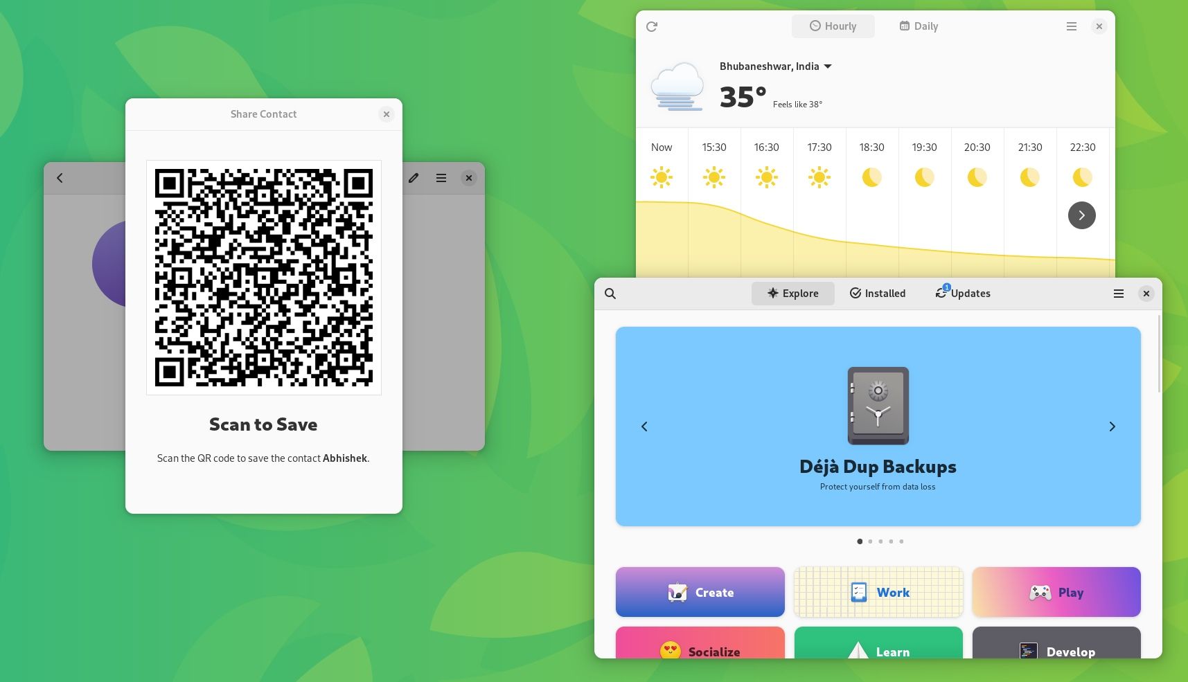
In addition, there are a few essential changes to note, those include:
- Epiphany browser ported to GTK4
- You have a new way to uninstall apps through CLI (merge request)
- Ability to filter only open-source apps on GNOME Software
- Ability to share contacts with a QR code
- Improvements to the Contact app
- Improvements to Maps, including a fix to make keyboard navigation work on search results
- Subtle changes to the Weather app
Suggested Read 📖
GNOME 44: Waiting to Upgrade?
You can experience it on Fedora 38 and Ubuntu 23.04.
Of course, GNOME 44 is available on Arch Linux repo as well.
- Even the biggest players in the Linux world don't care about desktop Linux users. We do.
- We don't put informational content behind paywall. Your support keeps it open for everyone. Think of it like 'pay it forward'.
- Don't like ads? With the Plus membership, you get an ad-free reading experience.
- When millions of AI-generated content is being published daily, you read and learn from real human Linux users.
- It costs just $2 a month, less than the cost of your favorite burger.
Become a Plus Member today and join over 300 people in supporting our work.


