Recently, GNOME seems to be focusing on replacing old defaults with newer ones, and depending on who you ask, it is a welcome move. It helps the popular desktop environment look and feel more refined, with unified styling across apps and the interface.
They have been slowly, but surely revamping their core application stack with a modern GTK4 + Libadwaita approach being adopted for newer applications.
But, this time around, the default font “Cantarell” seems to be on the GNOME developers' focus, which might be getting replaced with a newer, more maintained alternative.
Is It Time To Say Goodbye To Cantarell?

Initially proposed by GNOME foundation member Cassidy James Blaede seven months ago, the GNOME design team had been going back and forth with the idea of using Inter as the default font for future releases of GNOME.
Interestingly, a few days back, Jakub Steiner successfully merged a change that would switch the default font to “Inter Variable 11”. But, that's not a final change, you will know why soon.
As expected in an open development environment, some concerns were raised when the initial proposal went out, with one of the key ones being the readability/accessibility aspect of Inter, compared to Cantarell.
One such issue was raised by Maksym Hazevych, who mentioned that the letters I and L were impossible to differentiate, and a word like “illness” would become “|||ness”. They were also worried about Inter being broken for Ukrainian, but that issue has since been fixed.

For the I and L issue, the optional feature for disambiguating between similar-looking characters on Inter was floated by Fernando Miguel Hahne, and that seems to have caught on with other members of the GNOME design team.
In response to this proposal, another alternative to Cantarell was also pitched.
kramo, GNOME foundation member and the lead developer of Cartridges, brought forward Noto Sans (commissioned by Google) as a potentially better option than Inter.
On the issue tracker, Allan Day from the GNOME design team added that:
The main reason why we've avoided Noto in the past is stylistic, and trying it again now I'm still convinced by it on that basis. I think that there's a reason why, despite having commissioned Noto, Google doesn't use by default in Android.
Weeks have passed since the above-mentioned saga unfolded, and when Jakub committed the change for switching the default font to Inter, Jeremy Bicha asked whether the initial proposal and the proposal for using Noto Sans should be closed.
To that, kramo replied:
Not yet, neither. We're hoping to land it this cycle but a revert is definitely not off the table as this is a pretty big change.
And, that looks like this change is closer to becoming the default. But, testing is still ongoing, and until the initial proposal (linked above) and related ones are set to closed, this is not a final change.
We can only wait and see, if this lands before the upcoming GNOME 47 release, which is set for a mid-September release.
Want an early sneak peek?


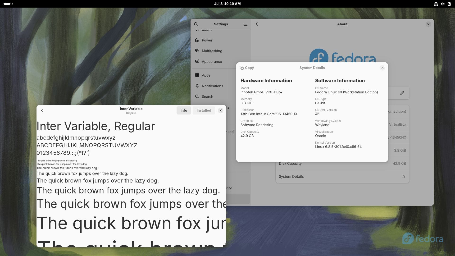
Left: Cantarell Right: Inter
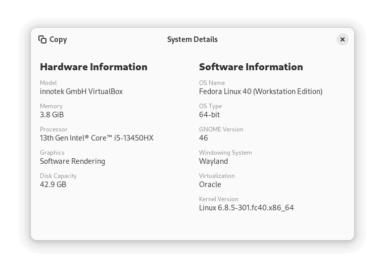
This is how Inter looked in comparison to Cantarell when I switched to it on a Fedora 40 Workstation virtual machine running GNOME 46.
I was impressed with what Inter looked like. 😃
You can do it too, just follow these steps on a GNOME-equipped system to get started:
- Download the latest Inter release from its GitHub repo (.zip file).
- Extract the downloaded file; double-clicking should do the same if using the Files app.
- Open/Install InterVariable.ttf and InterVariable-Italic.ttf with the “Fonts” app.
- Run the following command in the terminal to switch to Inter:
gsettings set org.gnome.desktop.interface font-name 'Inter Variable 11'
- Log out or Restart your computer, and check if the default font was changed correctly.
If you want to go back, just run:
gsettings reset org.gnome.desktop.interface font-nameIf you were looking for more insights, then the design team's initiative for this change is worth a read.
As usual, Reddit is all up and about over this fundamental change to GNOME. There are some pretty interesting opinions, and some humorous takeaways in one of the threads on the Linux Subreddit.
💬 What about you? Have any such takeaways? You are welcome to add them below!
Via: omg! linux!
- Even the biggest players in the Linux world don't care about desktop Linux users. We do.
- We don't put informational content behind paywall. Your support keeps it open for everyone. Think of it like 'pay it forward'.
- Don't like ads? With the Plus membership, you get an ad-free reading experience.
- When millions of AI-generated content is being published daily, you read and learn from real human Linux users.
- It costs just $2 a month, less than the cost of your favorite burger.
Become a Plus Member today and join over 300 people in supporting our work.


